9 Probabilistic View
Chapter 8 emphasized the concept of sampling and introduced the crucial aspect of statistics: randomness. Although the mean represents the central tendency of the data, it does not encompass all the data points. Inevitable deviations occur, and we need a way to express this “randomness.” The concept of probability distributions aids in fully understanding the stochastic nature of observed data.
Key words: probability density function (PDF), probability mass function (PMF), expected value
9.1 Continuous Variable
9.1.1 Probability Density Function
Let me use the plant height example in Chapter 8:
# load csv data on R
df_h0 <- read_csv("data_raw/data_plant_height.csv")
While Chapter 8 primarily focused on exploring mean and variance, let’s broaden our perspective to gain a comprehensive understanding of the entire distribution of height.
df_h0 %>%
  ggplot(aes(x = height)) +
  geom_histogram(binwidth = 1, # specify bin width
                 center = 0.5) + # bin's center specification
  geom_vline(aes(xintercept = mean(height))) # draw vertical line at the mean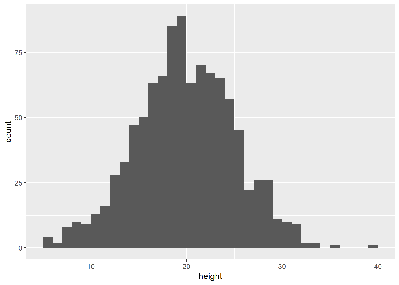
Figure 9.1: Distribution of plant height
This distribution comprises a thousand height measurements. However, there are certain patterns to consider. The data is centered around the mean and exhibits a symmetrical distribution. This characteristic implies that the distribution can be approximated by a simple formula that relies on only a few key parameters.
In statistics, the symmetrical bell-shaped form is commonly approximated by a Normal distribution, often denoted as “variable \(x\) is assumed to follow a Normal distribution.” We express this using the following mathematical expression:
\[ x \sim \mbox{Normal}(\mu, \sigma^2) \]
Unlike an “equation,” we do not use the “\(=\)” sign because variable \(x\) is not equivalent to the Normal distribution. Rather, it represents a “stochastic” relationship that signifies the probability of \(x\) taking on a specific range of values.
A Normal distribution is characterized by two parameters: the mean and the variance. Strictly speaking, the terms “mean” and “variance” in a probability distribution differ from “sample mean” and “sample variance,” although they converge when the variable \(x\) is assumed to follow a Normal distribution (refer to Chapter 15 for more details). More precisely, the mean is referred to as the “expected value” and is denoted as \(\mbox{E}(x)\). The variance represents the expected value of \(x^2\) and is denoted as \(\mbox{E}(x^2)\). The expected value serves as the central tendency of a random variable, indicating where values are most likely to occur. On the other hand, the variance quantifies the extent to which individual data points deviate from this expected value. Although I use the terms mean and variance for simplicity, it is important to recognize the distinction.
Once these parameters are determined, the formula that defines the Normal distribution will yield the probability density for a given range of values. This formula \(f(x)\) is known as the probability density function (PDF) and is displayed below:
\[ f(x) = \frac{1}{\sqrt{2 \pi} \sigma} \exp\left(-\frac{(x-\mu)^2}{2\sigma^2}\right) \]
Well, understanding the meaning of a formula can be challenging without context. However, visualization can be a useful tool to help comprehend mathematical expressions.
9.1.2 PDF to frequency distribution
In R, the function dnorm() can be used to calculate the probability density for a given value. The first argument, x, should be a vector of values for which you want to calculate the probability density. The second argument, mean, and the third argument, sd, correspond to the mean and standard deviation of the distribution, respectively. Note that we must provide mean and sd to calculate the probability density.
To encompass the entire range of observed heights, we can use \(\text{min}(x)\) and \(\text{max}(x)\) as the lower and upper limits, respectively.
# vector of x values
# seq() generate min to max values with specified numbers of elements or interval
# the following produce 100 elements
x <- seq(min(df_h0$height), max(df_h0$height), length = 100)

# calculate probability density
mu <- mean(df_h0$height)
sigma <- sd(df_h0$height)
pd <- dnorm(x, mean = mu, sd = sigma)

# figure
tibble(y = pd, x = x) %>% # data frame
  ggplot(aes(x = x, y = y)) +
  geom_line() + # draw lines
  labs(y = "Probability density") # re-label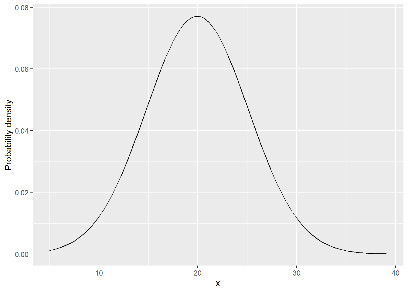
Figure 9.2: Probability density function of a Normal distribution
The shape of the curve appears quite similar to what we observed; however, the scale of the y-axis is different. This is because the y-axis represents “probability density.” To convert it into actual “probability,” we need to calculate the area under the curve. In R, we can utilize the pnorm() function for this purpose. It calculates the probability of a variable being less than the specified value, which is provided in the first argument q.
## [1] 0.02731905## [1] 0.504426
# probability of 10 < x < 20
p20_10 <- p20 - p10
print(p20_10)
## [1] 0.4771069To make the estimates comparable to the frequency data, you can calculate the probability for each 1 cm bin. The expected frequency can be obtained by multiplying the probability by the sample size, which in this case is 1000. This allows you to estimate the number of observations you would expect in each 1 cm bin based on the calculated probabilities.
x_min <- floor(min(df_h0$height)) # floor takes the integer part of the value
x_max <- ceiling(max(df_h0$height)) # ceiling takes the next closest integer
bin <- seq(x_min, x_max, by = 1) # each bin has 1cm

p <- NULL # empty object for probability
for (i in 1:(length(bin) - 1)) {
  p[i] <- pnorm(bin[i+1], mean = mu, sd = sigma) - pnorm(bin[i], mean = mu, sd = sigma)
}

# data frame for probability
# bin: last element [-length(bin)] was removed to match length
# expected frequency in each bin is "prob times sample size"
# "+ 0.5" was added to represent a midpoint in each bin
df_prob <- tibble(p, bin = bin[-length(bin)] + 0.5) %>%
  mutate(freq = p * nrow(df_h0))
Overlay:
df_h0 %>%
  ggplot(aes(x = height)) +
  geom_histogram(binwidth = 1, # specify bin width; must match the bin width used for probability
                 center = 0.5) + # bin's center position
  geom_point(data = df_prob,
             aes(y = freq,
                 x = bin),
             color = "salmon") +
  geom_line(data = df_prob,
            aes(y = freq,
                x = bin),
            color = "salmon")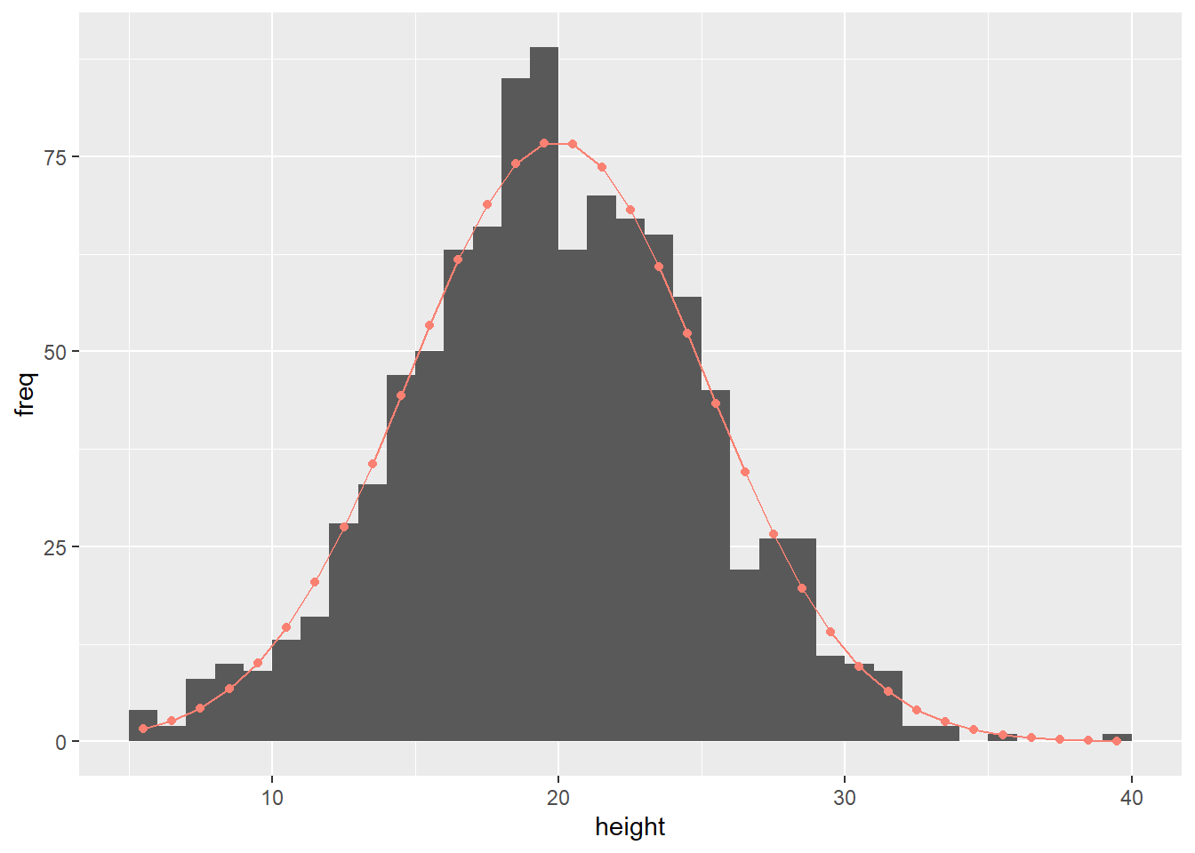
Figure 9.3: Histogram overlaid with predicted frequency (red dots and line)
It is remarkable that the probability distribution, characterized by just two parameters (mean and variance), can effectively reproduce the overall shape observed in the original data set of 1000 data points. This is great news because it means that once we determine these key parameters, we can infer the general pattern of the data.
9.2 Discrete Variable
9.2.1 Probability Mass Function
Let’s shift our perspective and examine the density of plants in the garden. For this analysis, we have counted the number of plant individuals within 30 plots, with each plot covering an area of one square meter (refer to Figure 9.4).
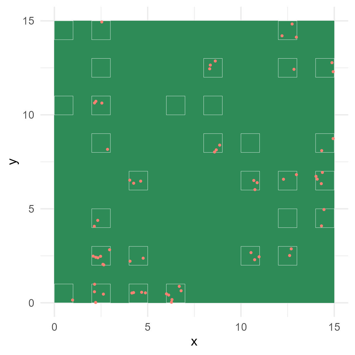
Figure 9.4: Garden view with sampling plots. White squares represent plots. Red dots indicate plant individuals counted.
Download the data here and load it onto R:
## # A tibble: 30 × 3
##     plot count nitrate
##    <dbl> <dbl>   <dbl>
##  1     1     3    31.3
##  2     2     1    27.4
##  3     3     4    31.9
##  4     4     1    30.1
##  5     5     4    29.8
##  6     6     1    30.4
##  7     7     2    32
##  8     8     0    18.3
##  9     9     2    31.7
## 10    10     2    34
## # ℹ 20 more rows
Make a histogram:
df_count %>%
  ggplot(aes(x = count)) +
  geom_histogram(binwidth = 0.5, # define binwidth
                 center = 0) # relative position of each bin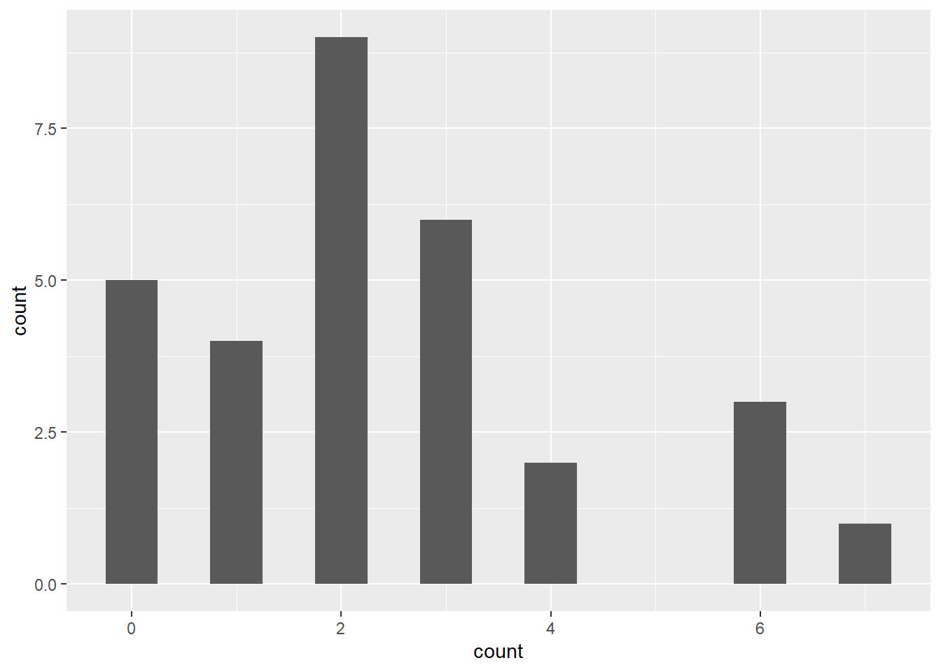
Figure 9.5: Histogram of plant individuals per plot
There are several significant differences compared to the plant height example when considering the density of plants in the garden:
The possible values are discrete (count data) since we are counting the number of plant individuals in each plot.
The possible values are always positive, as counts cannot be negative.
The distribution appears to be non-symmetric around the sample mean.
Given these characteristics, a Normal distribution may not be an appropriate choice for representing such a variable. Instead, it would be more suitable to use a Poisson distribution to characterize the observed distribution of the discrete variable.
\[ x \sim \mbox{Poisson}(\lambda) \]
In a Poisson distribution, the mean parameter (\(\lambda\)) serves as the sole parameter2. Probability distributions that describe discrete variables are expressed using a probability mass function (PMF):
\[ g(x) = \frac{\lambda^x \exp(-\lambda)}{x!} \]
Unlike a probability density function (PDF), a probability mass function (PMF) represents the probability of a discrete variable \(x\) taking a specific value. For instance, the probability of \(x=2\), denoted as \(\Pr(x=2)\), can be calculated as follows:
\[ \Pr(x=2) = g(2) = \frac{\lambda^2 \exp(-\lambda)}{2!} \]
In a generalized form, we write:
\[ \Pr(x=k) = g(k) = \frac{\lambda^k \exp(-\lambda)}{k!} \]
9.2.2 PMF to frequency distribution
In R, you can use the dpois() function to visualize a Poisson distribution. This function allows you to plot the probability mass function (PMF) of the Poisson distribution and gain insights into the distribution of the discrete variable. In the given example, I utilize the sample mean as an estimate for \(\lambda\) — a somewhat counter-intuitive approach since \(x\) does not conform to a Normal distribution. However, I will delve into a detailed explanation in Chapter 15, allowing me to assume its validity for the time being.
# vector of x values
# create a vector of 0 to 10 with an interval one
# must be integer of > 0
x <- seq(0, 10, by = 1)

# calculate probability mass
lambda_hat <- mean(df_count$count)
pm <- dpois(x, lambda = lambda_hat)

# figure
tibble(y = pm, x = x) %>% # data frame
  ggplot(aes(x = x, y = y)) +
  geom_line(linetype = "dashed") + # draw dashed lines
  geom_point() + # draw points
  labs(y = "Probability",
       x = "Count") # re-label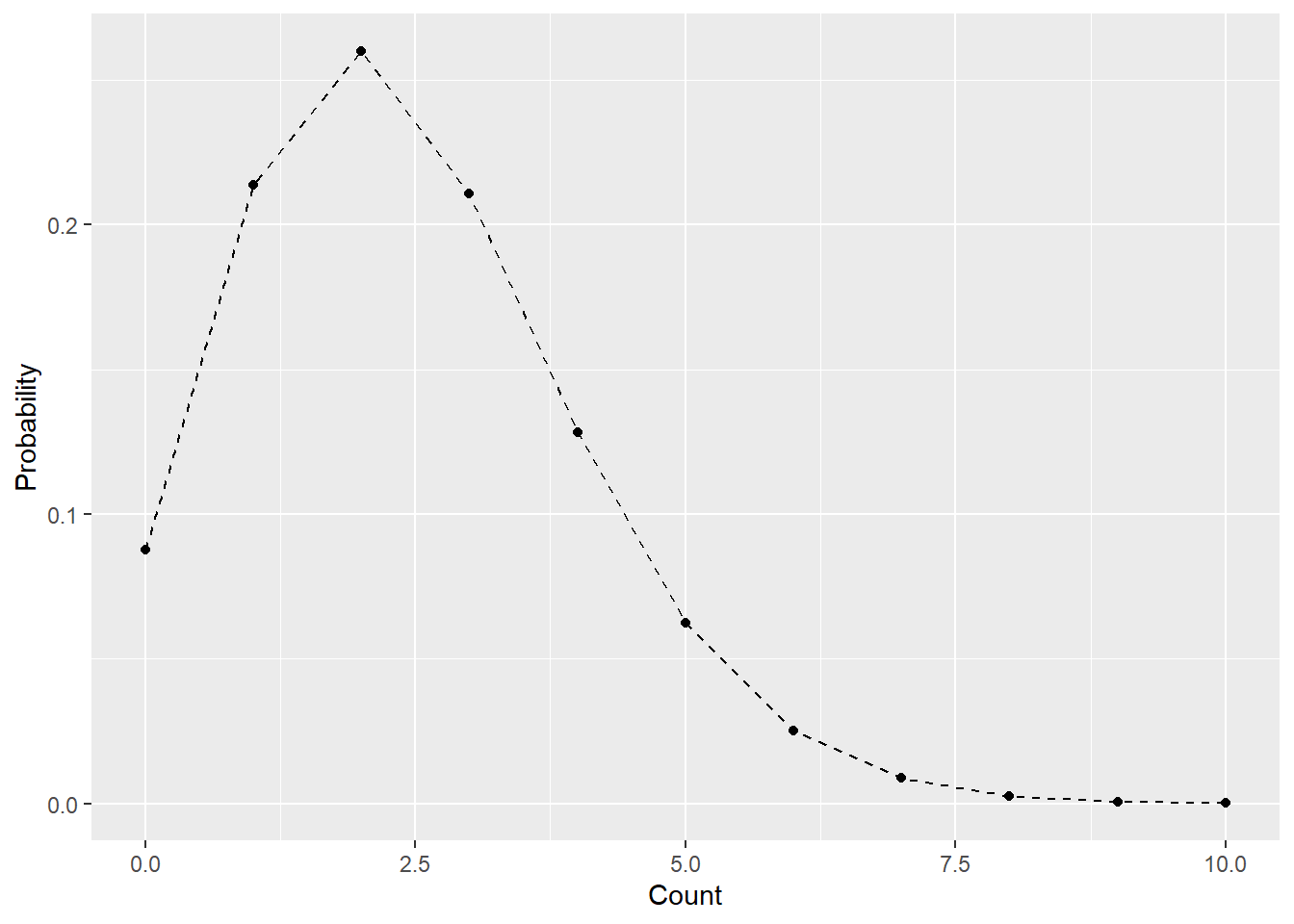
Figure 9.6: Example of a Poisson distribution
To convert the y-axis from probability to frequency, multiply the probabilities by the sample size (total number of observations) to obtain the expected frequency. As in the plant height example, you can plot the expected frequency on the histogram, providing a visual representation of the distribution of the discrete variable.
df_prob <- tibble(x = x, y = pm) %>%
  mutate(freq = y * nrow(df_count)) # prob x sample size

df_count %>%
  ggplot(aes(x = count)) +
  geom_histogram(binwidth = 0.5, # must be divisible number of one; e.g., 0.1, 0.25, 0.5...
                 center = 0) +
  geom_line(data = df_prob,
            aes(x = x,
                y = freq),
            linetype = "dashed") +
  geom_point(data = df_prob,
             aes(x = x,
                y = freq))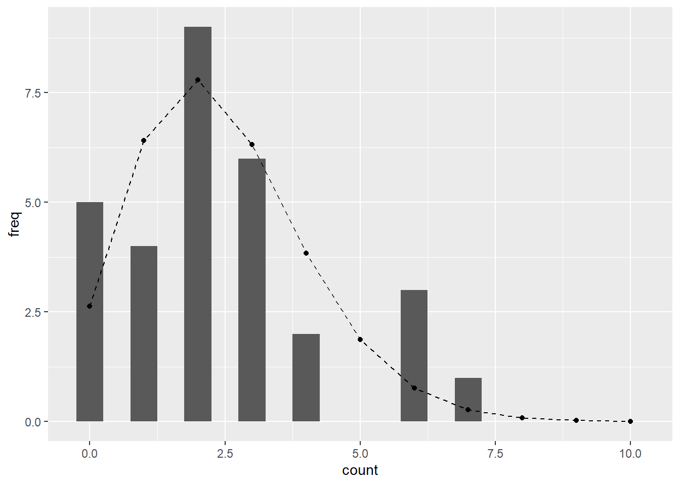
Figure 9.7: Observed histogram of the discrete variable overlaid with the Poisson expectation.
Cool, the Poisson distribution does an excellent job of characterizing the distribution of plant counts.
9.3 Why Probability Distributions?
As we have seen in the above examples, probability distributions provide a framework for describing the likelihood of different outcomes or events. By utilizing probability distributions, we can:
- Make predictions and estimate probabilities of specific events or ranges of values.
- Determine the most likely values or outcomes based on available information.
- Quantify and analyze the uncertainty associated with random variables or processes.
Probability distributions serve as fundamental tools in statistics, enabling us to model, analyze, and make informed decisions in the face of uncertainty.