23 Time-Series Analysis
Time-Series Analysis is one of the most challenging topics in statistics because it violates a fundamental assumption: the independence of data points. Nevertheless, this type of data is common in biology and is often analyzed incorrectly. In this section, we will explore common pitfalls in time-series analysis and review statistical models that can account for temporal dependence.
Learning Objectives:
Understand the challenges inherent in time-series analysis.
Learn basic modeling approaches for time-series data.
Learn how to incorporate external predictors into time-series models.
pacman::p_load(tidyverse,
               forecast,
               lterdatasampler,
               daymetr,
               glarma)
23.1 Pitfall of Time-Series
23.1.1 Time-series anormalies
Let’s explore a simple time series dataset, showing air-quality anomalies measured over 100 years.
url <- "https://raw.githubusercontent.com/aterui/biostats/master/data_raw/data_ts_anormaly.csv"
(df_ts <- read_csv(url))
## # A tibble: 100 × 2
## anormaly year
## <dbl> <dbl>
## 1 0 1926
## 2 -0.560 1927
## 3 -0.791 1928
## 4 0.768 1929
## 5 0.839 1930
## 6 0.968 1931
## 7 2.68 1932
## 8 3.14 1933
## 9 1.88 1934
## 10 1.19 1935
## # ℹ 90 more rowsThe plot of this dataset shows that air-quality anomalies tend to increase over time.
# Plot time-series anomalies
df_ts %>%
  ggplot(aes(x = year,          # Map 'year' to the x-axis
             y = anormaly)) +  # Map 'anormaly' to the y-axis
  geom_line() +                  # Add a line connecting the points
  geom_point() +                 # Add points at each observation
  theme_bw() +                   # Use a clean black-and-white theme
  labs(
    x = "Year",                     # Label x-axis
    y = "Anomaly"                   # Label y-axis
  )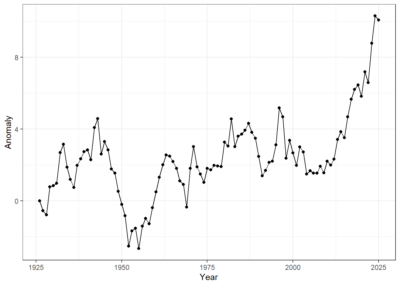
Figure 23.1: Time-series of annual anomalies. Points represent observed values for each year, and lines connect consecutive observations to highlight temporal trends.
Providing statistical evidence appears straightforward — we can simply regress anomalies on time.
# Fit a simple linear model: anomaly as a function of year
m_lm <- lm(anormaly ~ year, data = df_ts)

# Show the model summary
summary(m_lm)
##
## Call:
## lm(formula = anormaly ~ year, data = df_ts)
##
## Residuals:
## Min 1Q Median 3Q Max
## -4.0830 -1.1333 -0.1559 1.2911 5.6330
##
## Coefficients:
## Estimate Std. Error t value Pr(>|t|)
## (Intercept) -90.770684 12.715802 -7.138 1.66e-10 ***
## year 0.047154 0.006436 7.327 6.73e-11 ***
## ---
## Signif. codes: 0 '***' 0.001 '**' 0.01 '*' 0.05 '.' 0.1 ' ' 1
##
## Residual standard error: 1.858 on 98 degrees of freedom
## Multiple R-squared: 0.3539, Adjusted R-squared: 0.3473
## F-statistic: 53.68 on 1 and 98 DF, p-value: 6.729e-11There is a strong, positive effect of observation year, with a slope estimate of 0.04, indicating that anomalies increase by 0.04 per year on average.
df_ts %>%
  ggplot(aes(x = year,
             y = anormaly)) +  # Set up the plot: x = year, y = anomaly
  geom_line(linetype = "dotted") +     # Draw a dotted line connecting the points
  geom_point(alpha = 0.25) +           # Add points with transparency (alpha = 0.25)
  geom_abline(intercept = coef(m_lm)[1],  # Add regression line from linear model
              slope = coef(m_lm)[2]) +
  theme_bw()                             # Use a clean black-and-white theme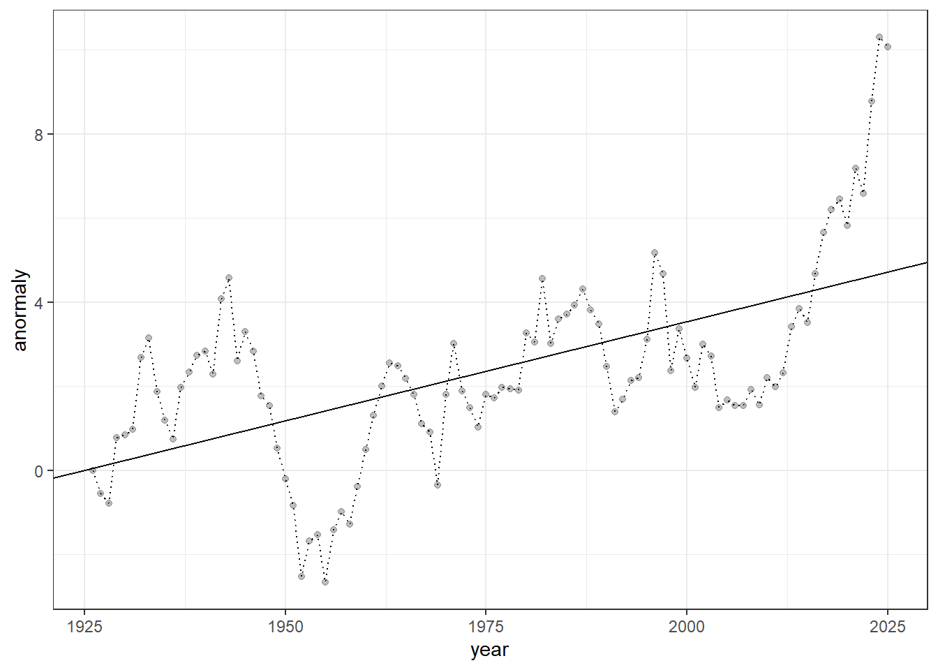
Figure 23.2: Time-series of anomalies over years. Dotted lines connect consecutive observations, semi-transparent points show individual measurements, and the solid line represents the fitted linear trend from a linear regression model.
The regression line may appear to fit the data well, with no obvious issues. However, if you think that, you have already fallen into a common pitfall of time-series analysis — this type of analysis has many potential problems.
23.1.2 Temporal autocorrelation
While the data appear to show an increasing trend, this dataset was generated from a simulation that assumes NO true temporal increase — it was produced through a process known as a random walk.
\[ y_t = y_{t-1} + \varepsilon_{t}\\ \varepsilon_t \sim \text{Normal}(0, \sigma^2) \]
This system is unique because each observation depends on its immediate past: the previous value (\(y_{t-1}\)) plus noise (\(\varepsilon_t\)) produces the current value (\(y_t\)).
The behavior of a random walk is highly stochastic, producing very different patterns in each simulation run. You can observe this by running the following code, which generated the dataset shown above.
# Initialize a vector to store the time series (100 time steps)
y <- rep(NA, 100)

# Generate random noise for each time step
eps <- rnorm(n = length(y))

# Set the initial condition of the time series
y[1] <- 0

# Generate a random walk:
# each value equals the previous value plus random noise
for (t in 1:(length(y) - 1)) {
  y[t + 1] <- y[t] + eps[t]
}

# Combine the time series with a corresponding year variable
df_y <- tibble(
  anormaly = y,
  year = 1925 + seq_len(length(y))
)

# Plot time-series anomalies (not shown)
df_y %>%
  ggplot(aes(x = year,
             y = anormaly)) +
  geom_line() +
  geom_point() +
  theme_bw() +
  labs(
    x = "Year",
    y = "Anomaly"
  )
This is expected because we are measuring the same object over time, so the observations are not independent. This leads to temporal autocorrelation, a feature that violates a fundamental assumption of many statistical methods — the independence of data points. Temporal autocorrelation can be assessed using the acf() function in R:
## Data must be ordered from the oldest observation to the most recent
df_ts <- arrange(df_ts, year)
acf(df_ts$anormaly)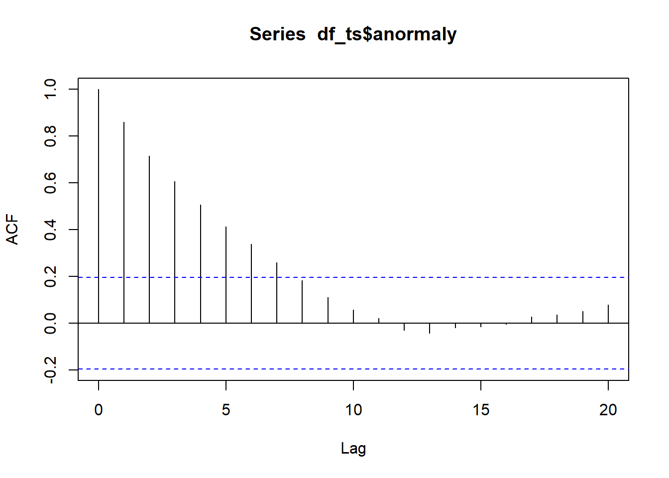
Figure 23.3: Autocorrelation function plot. The x-axis represents the lag, or the time difference between observations (e.g., lag 1 is the correlation between consecutive observations, lag 2 is two steps apart, etc.), while the y-axis shows the autocorrelation coefficient, ranging from -1 to 1, indicating how strongly observations at that lag are correlated.
In an ACF (autocorrelation function) plot, the x-axis represents the lag, or the time difference between observations (e.g., lag 1 is the correlation between consecutive observations, lag 2 is two steps apart, etc.), while the y-axis shows the autocorrelation coefficient, ranging from -1 to 1, indicating how strongly observations at that lag are correlated.
Positive values mean observations tend to move in the same direction as previous ones, negative values indicate opposite movement, and values near zero suggest little or no correlation. The dashed lines represent approximate confidence bounds, so spikes outside these lines indicate statistically significant correlations at that lag.
Treating temporally correlated measurements as independent can seriously compromise statistical inference and lead to unsupported conclusions.
Below, we explore how to accommodate the challenging nature of time-series data using basic models, and how these models can be extended to assess the influence of external factors that also change over time in biological data analysis.
23.2 Basic Models
As a starting point, we will focus on AR, MA, and ARMA models, all of which assume a stationary process. We will then extend these frameworks to the ARIMA model, which incorporates an integration step to handle non-stationary time series.
Stationarity is a fundamental concept in time-series analysis: a stationary process has a constant mean, variance, and autocorrelation structure over time. Non-stationarity means that one or more of these properties change through time—for example, the series may exhibit trends, shifts in variability, or evolving temporal dependence—making direct modeling and inference more challenging without first transforming the data.
We will use the built-in LakeHuron dataset to learn the implementation of these modeling approaches. All of the models discussed above can be implemented using the Arima() function from the forecast package, since AR, MA, and ARMA models are all special cases of the more general ARIMA framework.
# Create a tibble (modern data frame) from the LakeHuron time series
df_huron <- tibble(
  year = time(LakeHuron),                # Extracts the time component (years) from the LakeHuron ts object
  water_level = as.numeric(LakeHuron)    # Converts LakeHuron values to numeric (from ts class)
) %>%
  arrange(year)                           # Ensures the data is ordered by year

# Plot Lake Huron time series with a linear trend
df_huron %>%
  ggplot(aes(x = year, y = water_level)) +
  geom_point(alpha = 0.25) +       # Semi-transparent points
  geom_line(linetype = "dotted") + # Dotted line connecting points
  geom_smooth(method = "lm",       # Linear trend line
              color = "black",
              linewidth = 0.5) +
  theme_bw() +
  labs(x = "Year", y = "Water Level")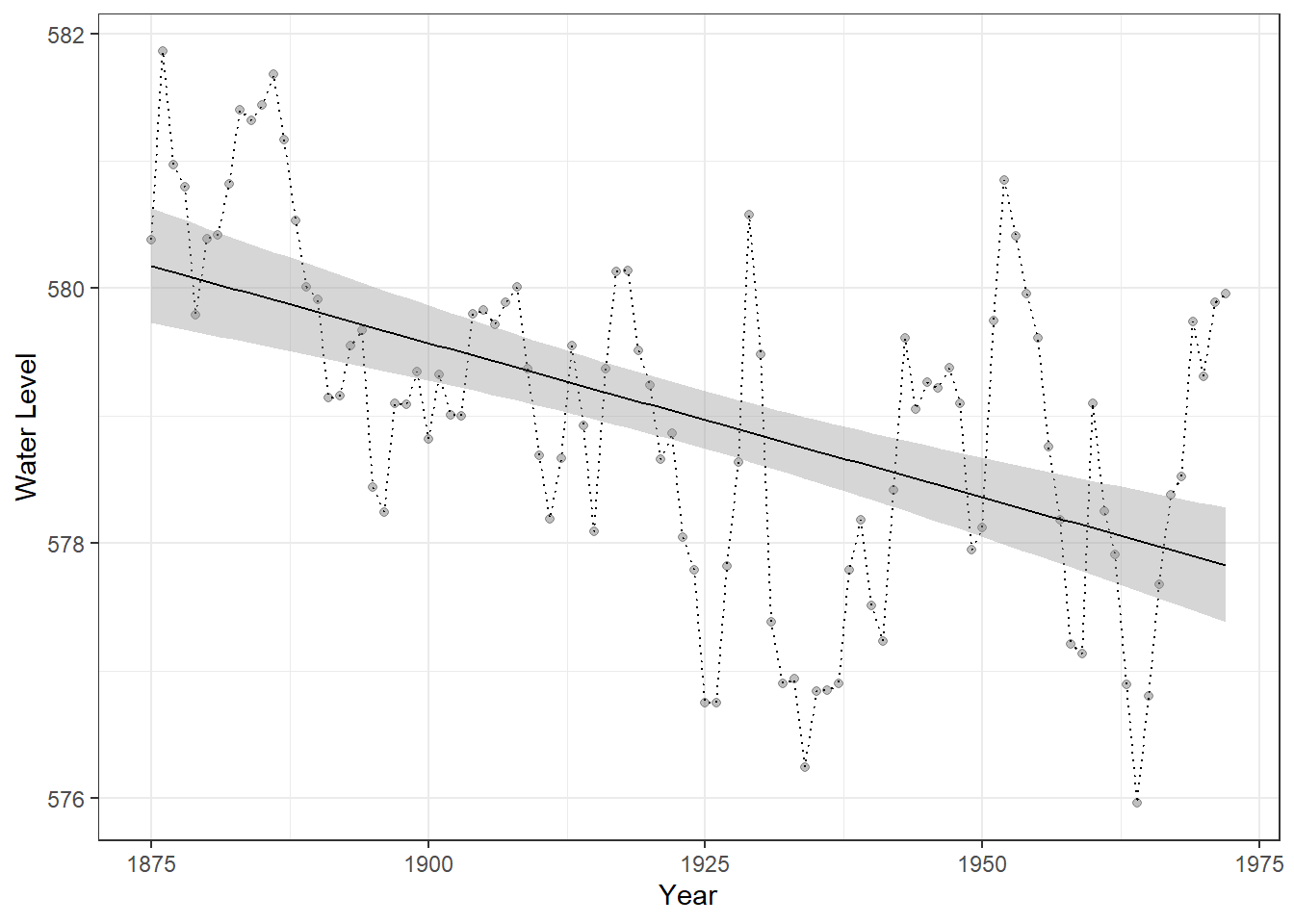
Figure 23.4: Time series of Lake Huron water levels from 1875 to 1972. Points represent annual water levels, and the dotted line connects consecutive observations. The solid black line shows a linear trend for reference only, providing a visual guide to the overall direction of change and facilitating comparison with predictions from time-series models.
23.2.1 AR Model
An autoregressive (AR) model describes a time series in which the current value depends on one or more of its past values plus random noise.
\[ y_t = \mu + \sum_{i=1}^p \phi_i y_{t - i} + \varepsilon_t \]
where \(\mu\) is the constant term (intercept), \(\phi_i\) is the autoregressive parameter, and \(\varepsilon_t\) is the (white) noise.
In an AR(\(p\)) model, the present observation is a linear combination of the previous \(p\) observations. The \(p\) is referred to as the order of the model. AR models are stationary when the sum of autoregressive parameters \(\sum_i \phi_i\) are less than one – this is analogous to population models with a carrying capacity in ecology.
In practice, we supply a vector of time-series data to the arima() function. We will begin with the simplest autoregressive model of order one, which is specified by setting the first element of the order argument to 1 (i.e., order = c(1, 0, 0)).
(m_ar1 <- Arima(
  df_huron$water_level,       # The time series data we want to model
  order = c(1, 0, 0)          # ARIMA model orders: c(p, d, q)
))
## Series: df_huron$water_level
## ARIMA(1,0,0) with non-zero mean
##
## Coefficients:
## ar1 mean
## 0.8375 579.1153
## s.e. 0.0538 0.4240
##
## sigma^2 = 0.5199: log likelihood = -106.6
## AIC=219.2 AICc=219.45 BIC=226.95This setup corresponds to setting the order (\(p = 1\)) in an AR model, meaning the process “remembers” the previous observation. The remaining elements of the order argument define the other components of the model, which are relevant for the additional models introduced below.
We can extract the in-sample fitted values from the AR(1) model using the fitted() function. Below, we compare these model predictions with a simple linear trend to illustrate how the time-series model captures temporal dependence beyond what a linear model provides.
# Add fitted values from AR(1) model to the dataset
df_huron_ar1 <- df_huron %>%
  mutate(fit = fitted(m_ar1) %>%   # Extract fitted (in-sample predicted) values from the AR(1) model
           as.numeric())           # Convert to numeric if necessary

# Plot observed and fitted values
df_huron_ar1 %>%
  ggplot() +
  geom_point(aes(x = year,
                 y = water_level),
             alpha = 0.25) +        # Plot observed water levels
  geom_line(aes(x = year,
                y = fit),           # Plot AR(1) fitted values
            color = "steelblue") +
  theme_bw()                        # Clean black-and-white theme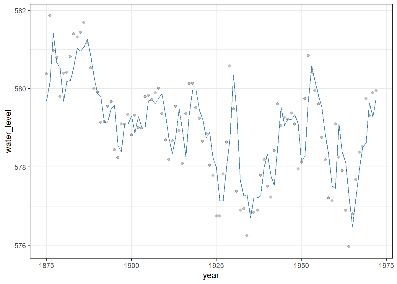
Figure 23.5: Observed Lake Huron water levels (points) with in-sample fitted values from an AR(1) model (steelblue line). The AR(1) model captures temporal dependence in the series, providing a better representation of year-to-year variation than a simple linear trend.
AR models assume stationarity, meaning their expected values and variance remain constant over time. When projecting time-series data into the future, AR models can produce forecasts that account for temporal dependence, often giving a very different and more realistic picture than a simple linear trend.
The predict() function preforms the projection with the n.ahead argument.
# Add in-sample fitted values
df_huron_ar1 <- df_huron %>%
  mutate(fit = fitted(m_ar1) %>% as.numeric())

# Forecast the next 50 time points using the AR(1) model
df_pred_ar1 <- forecast::forecast(m_ar1, h = 50) %>%
  as_tibble(rownames = "year") %>%
  janitor::clean_names() %>%
  mutate(year = as.numeric(year) + min(df_huron$year)) %>%
  rename(fit = point_forecast)

# Combine historical AR(1) fitted values and future forecasts, then plot
df_huron_ar1 %>%
  bind_rows(df_pred_ar1) %>%
  ggplot() +
  geom_point(aes(x = year, y = water_level),  # Observed water levels (semi-transparent)
             alpha = 0.25) +
  geom_ribbon(aes(x = year,                   # Visualize forecast uncertainty
                  ymin = lo_95,
                  ymax = hi_95),
              fill = "grey",
              color = NA,
              alpha = 0.6) +
  geom_line(aes(x = year, y = fit),           # Fitted values for historical data + forecasts
            color = "steelblue") +
  theme_bw() +
  labs(x = "Year",
       y = "Water Level")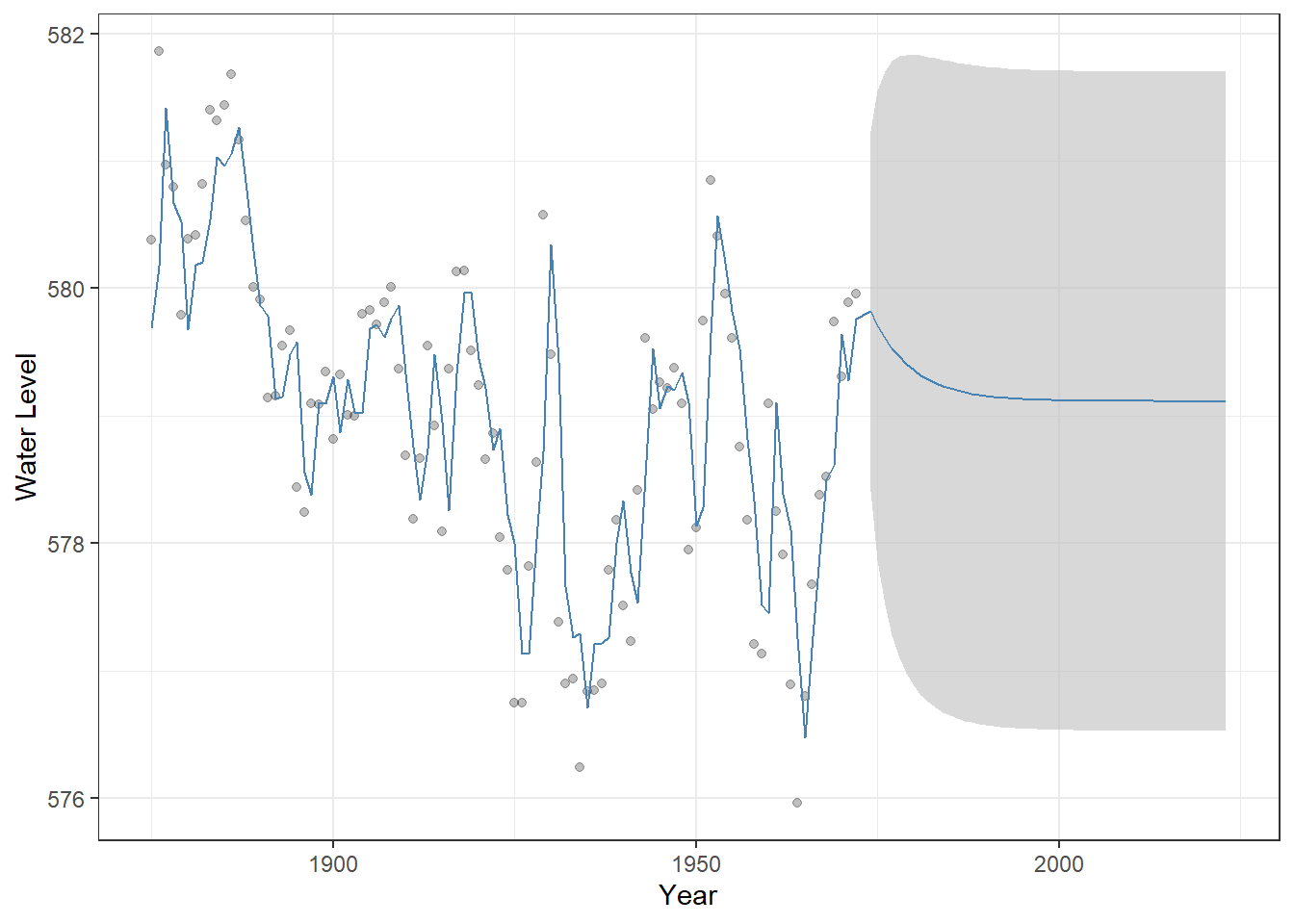
Figure 23.6: Observed Lake Huron water levels (points) with AR(1) model fitted values and 50-year forecasts (steelblue line). The shaded grey ribbon represents 95% confidence intervals around the predictions, illustrating the uncertainty of the forecast. This visualization highlights how the AR(1) model captures temporal dependence and projects future values differently from a simple linear trend.
23.2.2 MA Model
A moving average (MA) model represents a time series as a function of past random noises rather than past observations. In an MA(q) model, the current value depends on the current and previous q error terms.
\[ y_t = \mu + \sum_{i=1}^q \theta_i \varepsilon_{t-i} + \varepsilon_t \]
where \(\mu\) is the constant term (intercept), \(\theta_i\) is the moving-average parameter, and \(\varepsilon_t\) is the (white) noise. In the Arima() function, specifying order = c(0, 0, 1) corresponds to a moving-average model of order 1 (MA(1)), where the current value depends on the most recent random noise.
(m_ma1 <- Arima(
  df_huron$water_level,       # The time series data we want to model
  order = c(0, 0, 1)          # ARIMA model orders: c(p, d, q)
))
## Series: df_huron$water_level
## ARIMA(0,0,1) with non-zero mean
##
## Coefficients:
## ma1 mean
## 0.8302 578.9982
## s.e. 0.0633 0.1580
##
## sigma^2 = 0.7517: log likelihood = -124.65
## AIC=255.3 AICc=255.55 BIC=263.05We can perform a similar fitting, forecasting, and visualization for MA models, which highlights how their behavior differs from AR models. In particular, the average of the projected values quickly converges to the average of observed values.
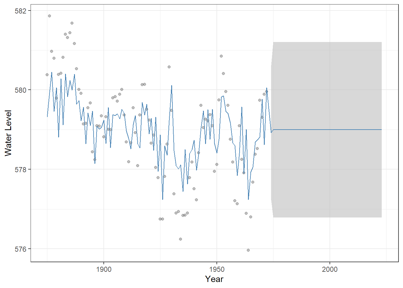
Figure 23.7: Observed Lake Huron water levels (points) with MA(1) model fitted values and 50-year forecasts (steelblue line). The shaded grey ribbon represents 95% confidence intervals around the predictions, illustrating the uncertainty of the forecast.
This convergence occurs because MA models capture autocorrelation in the error terms, but the current value does not directly depend on past observations, unlike AR models.
23.2.3 ARMA Model
An ARMA model combines both autoregressive and moving-average components, allowing the current value to depend on both past observations and past random noises.
\[ y_t = \mu + \sum_{i=1}^p\phi_i y_{t-i} + \sum_{i=1}^q \theta_i\varepsilon_{t-i} + \varepsilon_t \]
The parameters are defined as above. Since an ARMA model combines both AR and MA components, we specify order = c(1, 0, 1) to include first-order AR and MA terms, allowing the current value to depend on both the previous observation and the most recent random noise.
(m_arma <- Arima(
  df_huron$water_level,       # The time series data we want to model
  order = c(1, 0, 1)          # ARIMA model orders: c(p, d, q)
))
## Series: df_huron$water_level
## ARIMA(1,0,1) with non-zero mean
##
## Coefficients:
## ar1 ma1 mean
## 0.7449 0.3206 579.0555
## s.e. 0.0777 0.1135 0.3501
##
## sigma^2 = 0.4899: log likelihood = -103.25
## AIC=214.49 AICc=214.92 BIC=224.83We can visualize the ARMA(1,1) model in the same way as we did for the AR(1) and MA(1) models by combining historical fitted values with out-of-sample forecasts and displaying the uncertainty:
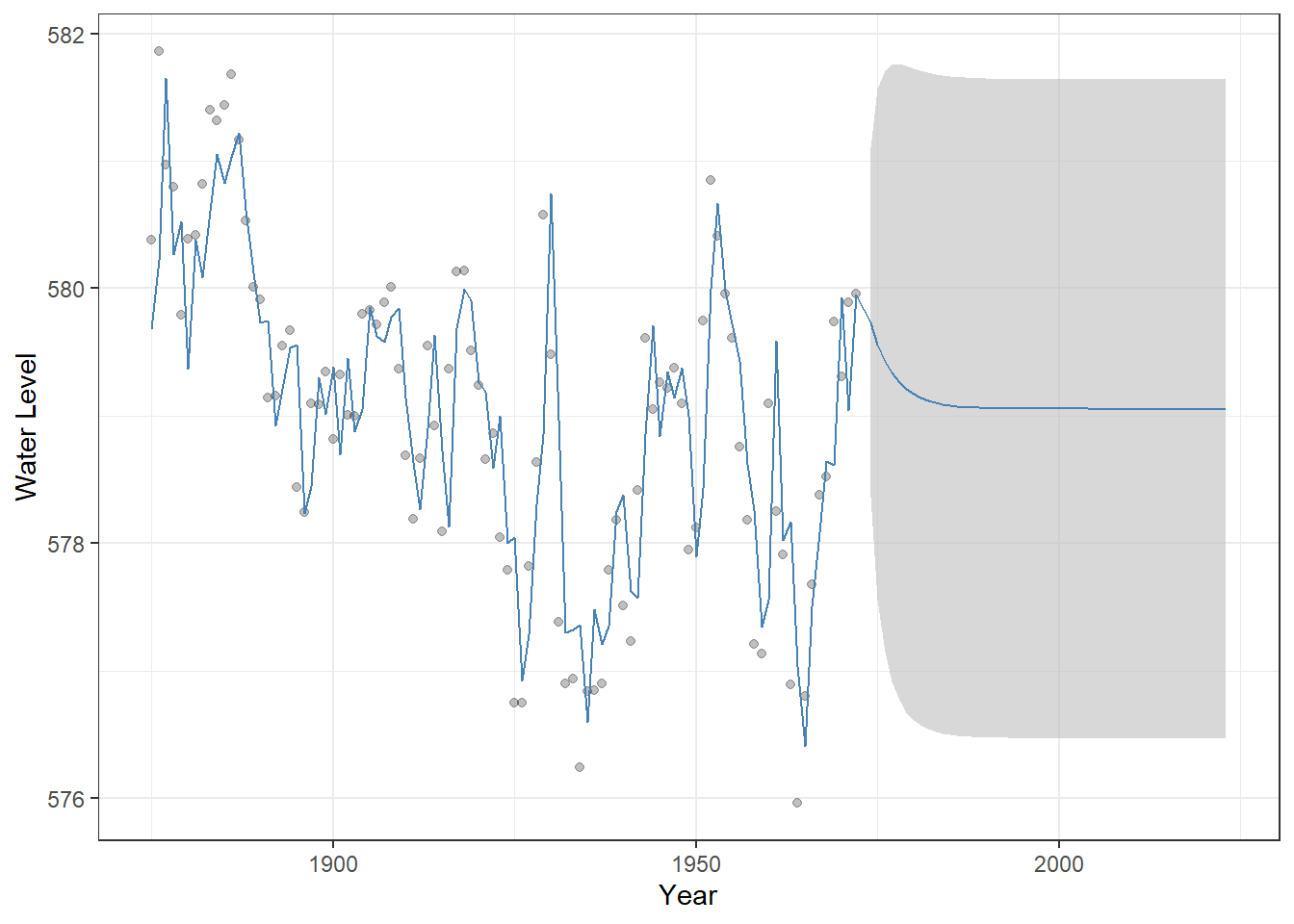
Figure 23.8: Observed Lake Huron water levels (points) with ARMA(1,1) model fitted values and 50-year forecasts (steelblue line). The shaded grey ribbon represents 95% confindence intervals around the predictions, illustrating the uncertainty of the forecast.
23.2.4 ARIMA model
An ARIMA model can be thought of as an ARMA model applied to the differenced series. To illustrate, consider an ARIMA model with first-order differencing. We define a new variable: \(\delta_t = y_t - y_{t-1}\).
The ARIMA then fits an ARMA(p, q) model to \(\delta_t\), capturing the autoregressive and moving-average structure in the differenced (stationary) series:
\[ \delta_t = \sum_{i=1}^p \phi_i \delta_{t-i} + \sum_{i=1}^q \theta_i \varepsilon_{t-i} +\varepsilon_t \]
This is a special case of the more general d-order ARIMA(p,d,q) model, specifically ARIMA(p,1,q) where \(d=1\). For more detailed explanations and examples, you can refer to well-developed documentation, such as Wikipedia
This extension allows ARIMA models to handle non-stationary time series, where the mean or trend changes over time. Here, we assume \(p=1\) and \(d=1\) to illustrate and gain insights into how the ARIMA model operates.
(m_arima <- Arima(df_huron$water_level,
                  order = c(1, 1, 0)))
## Series: df_huron$water_level
## ARIMA(1,1,0)
##
## Coefficients:
## ar1
## 0.1362
## s.e. 0.1021
##
## sigma^2 = 0.5544: log likelihood = -108.23
## AIC=220.45 AICc=220.58 BIC=225.6No constant term is estimated because the series is first-order differenced. The visualization highlights how the shifting mean influences the model’s projections over time – the uncertainty is greater than stationary models.
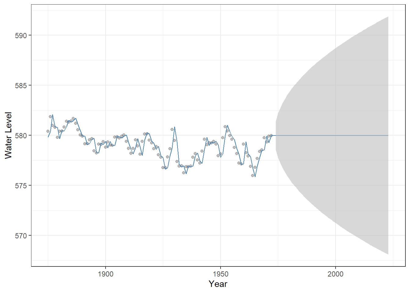
Figure 23.9: Observed Lake Huron water levels (points) with ARIMA(1,1,0) model fitted values and 50-year forecasts (steelblue line). The shaded grey ribbon represents 95% confindence intervals around the predictions, illustrating forecast uncertainty.
23.2.5 Model selection
Selecting the appropriate model and its orders can be challenging, because there are multiple model types (AR, MA, ARMA, ARIMA) and many possible combinations of parameters (p, d, q). One common approach to guide model selection is the use of information criteria, such as the Akaike Information Criterion (AIC), which balance model fit and complexity.
This approach is conveniently implemented in the forecast package. In particular, the function auto.arima() automatically searches over a range of ARIMA models and selects the combination of parameters that yields the most parsimonious model for your data, simplifying the model selection process.
# Possible extensions / additional arguments:
# max.p, max.q       : maximum AR and MA orders to consider
# d, D               : specify non-seasonal or seasonal differencing (or let auto.arima decide)
# seasonal           : include seasonal ARIMA components (TRUE/FALSE)
# max.P, max.Q       : maximum seasonal AR and MA orders
# approximation      : use approximation for faster computation on long series
# lambda             : Box-Cox transformation for stabilizing variance

auto.arima(
  df_huron$water_level, # data
  stepwise = FALSE,  # stepwise = FALSE: search all possible models rather than using stepwise approximation
  ic = "aic" # model selection based on AIC
)
## Series: df_huron$water_level
## ARIMA(2,1,1)
##
## Coefficients:
## ar1 ar2 ma1
## 0.9712 -0.2924 -0.9108
## s.e. 0.1137 0.1030 0.0712
##
## sigma^2 = 0.5003: log likelihood = -102.54
## AIC=213.07 AICc=213.51 BIC=223.37In this case, ARIMA(2,1,1) was selected, which suggests a non-stationary series with a shifting mean (due to differencing) and autocorrelations in the changes captured by the AR and MA terms.
23.3 Applied Models
While the time-series models introduced above allow us to account for temporal autocorrelation, our primary interest is often in how external variables influence the response. How, then, can we incorporate predictors into a time-series model?
Recall that a linear model has the following structure when predictors \(x\) are included:
\[ y_i = \alpha + \sum_k \beta_k x_{i}^{(k)} + \varepsilon_i \]
where \(\alpha\) is the intercept, and \(\beta\) is the slope. In this framework, we assume that the error term \(\varepsilon_i\) is independent across observations with \(\varepsilon_i \sim \text{Normal}(0, \sigma^2)\).
However, because we assume independence in the error term, problems arise when the data exhibit temporal autocorrelation. If we model the relationship between \(x\) and \(y\) as if the observations are independent, the effect of \(x\) can be estimated as artificially significant, increasing the risk of a Type I error; that is, we may conclude that \(x\) has a significant effect even when it does not.
We can include ARIMA components in the error term to account for temporal autocorrelation before evaluating the effects of external predictors. For example, if the error term follows an ARMA process, the model can be written as:
\[ y_t = \alpha + \sum_k \beta_k x_{t}^{(k)} + u_t\\ u_t = \underbrace{\sum_{i=1}^p \phi_i y_{t - i}}_{\text{AR}} + \underbrace{\sum_{i = 1}^q \theta_i \varepsilon_{t - i}}_{\text{MA}} + \underbrace{\varepsilon_t}_{\text{Noise}} \]R offers a variety of functions for performing this type of modeling. Let’s explore how it works in practice.
23.3.1 ARIMAX
ARIMAX is an ARIMA model that includes external predictors. To illustrate its use, we use ice-cover data from Lake Mendota, Wisconsin, available in the lterdatasampler R package. We focus on the period from 1980 to 2014 (35 years).
# Load and inspect the dataset
data("ntl_icecover")  # Built-in dataset with ice cover information for multiple lakes

# Convert to tibble and filter for a specific lake and years >= 1980
df_ice <- ntl_icecover %>%
  as_tibble() %>% # Convert to tibble for tidyverse-friendly operations
  filter(between(year, 1980, 2014), # Keep only years from 1980 onward
         lakeid == "Lake Mendota") %>% # Keep only data for Lake Mendota
  arrange(year) # Arrange by year

# Create a line + point plot of ice duration over time
df_ice %>%
  ggplot(aes(x = year, # Year on x-axis
             y = ice_duration)) + # Ice duration (days) on y-axis
  geom_line(linetype = "dotted") + # Add a dotted line connecting points
  geom_point(alpha = 0.25) + # Add semi-transparent points
  theme_bw() + # Use a clean black-and-white theme
  labs(y = "Ice duration",
       x = "Year")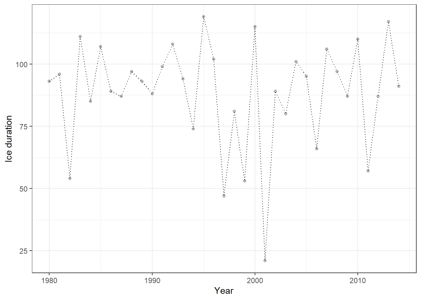
Figure 23.10: Ice-cover data for Lake Mendota (1980–2014) visualized as a dotted line with semi-transparent points. This plot shows the temporal trajectory of ice duration over 35 years, highlighting interannual variability.
We will explore how ice-cover duration varies with air temperature. Daily temperature data can be obtained from DAYMET, and the daymetr R package allows you to download these data directly into R.
# Download daily climate data from Daymet for Lake Mendota
list_mendota <- download_daymet(
  site = "Lake_Mendota",   # Arbitrary name you assign to this site
  lat = 43.1,              # Latitude of the lake
  lon = -89.4,             # Longitude of the lake
  start = 1980,            # Start year
  end = 2024,              # End year
  internal = TRUE          # Return the data as an R object rather than saving to disk
)
Because the original data format is difficult to work with, we will transform it into a structure compatible with the tidyverse framework. The following code calculates the average daily-minimum temperature.
df_temp <- list_mendota$data %>%
  as_tibble() %>%                  # Convert the data to a tibble for tidyverse-friendly operations
  janitor::clean_names() %>%       # Clean column names (lowercase, underscores)
  mutate(
    # Create a proper Date object from year and day-of-year
    date = as.Date(paste(year, yday, sep = "-"), format = "%Y-%j"),
    # Extract the month from the date
    month = month(date)
  ) %>%
  arrange(year, yday) %>%
  group_by(year) %>% # Group by year
  summarize(temp_min = round(mean(tmin_deg_c), 2)) # Compute average daily minimum temperature
We can now join the temperature data with the ice-duration data, enabling analysis of how air temperature influences ice-cover duration.
# Join the temperature data to the ice cover data by year
df_ice <- df_ice %>%
  left_join(df_temp, by = "year")
The Arima() and auto.arima() functions include an xreg argument, which allows us to supply potential predictor variables. xreg can be a vector or a matrix, but it must have the same number of rows as the response time series (ice duration in our case).
(obj_arima <- auto.arima(
  df_ice$ice_duration, # Response variable: ice duration time series
  xreg = df_ice$temp_min, # External predictor: average minimum temperature
  stepwise = FALSE # Use exhaustive search instead of stepwise approximation for model selection
))
## Series: df_ice$ice_duration
## Regression with ARIMA(1,0,0) errors
##
## Coefficients:
## ar1 intercept xreg
## -0.4650 107.3676 -8.0622
## s.e. 0.1484 6.6398 2.6708
##
## sigma^2 = 364.5: log likelihood = -151.44
## AIC=310.89 AICc=312.22 BIC=317.11The ARIMAX output now includes the estimated coefficient for the external predictor (xreg) along with the selected model structure (AR(1)). This coefficient represents the impact of temperature on ice-cover duration and appears to be highly significant, with an estimate of -8.06 and a standard error of 2.67.
We can also compute confidence intervals to obtain more detailed information about the uncertainty around this estimate. If the 95% confidence interval (CI) for a coefficient does not include zero, the estimate is considered statistically significant and highly reliable.
confint(obj_arima, level = 0.95)## 2.5 % 97.5 %
## ar1 -0.7559461 -0.1741116
## intercept 94.3538337 120.3814411
## xreg -13.2967927 -2.8276105In our case, the 95% confidence interval for the xreg coefficient (temperature effect) is entirely negative and does not overlap zero, indicating that ice duration decreases significantly as winter temperature increases.
Including predictor variables makes the forecast more meaningful. Although our model was fitted to data from 1980–2014, we have temperature observations for 2015–2024. While we use these observed temperatures in this exercise, the predictor values could also come from model outputs, such as climate model projections, allowing us to explore potential impacts of climate change.
# 1. Add fitted values from the ARIMAX model to the original ice-cover dataset
df_ice <- df_ice %>%
  mutate(fit = fitted(obj_arima)) # 'fitted()' gives the model's in-sample predicted values

# 2. Prepare new temperature data for forecasting
v_temp <- df_temp %>%
  filter(year > 2014) %>% # Select years beyond the original modeling period
  pull(temp_min) # Extract the temperature values as a numeric vector

# 3. Forecast ice duration for 2015–2024 using ARIMAX model with new temperature values
df_fore <- forecast::forecast(obj_arima, xreg = v_temp) %>% # Forecast with external predictor
  as_tibble() %>% # Convert forecast object to tibble
  janitor::clean_names() %>% # Clean column names
  rename(fit = point_forecast) %>% # Rename point forecast column to 'fit'
  mutate(year = 2015:2024) # Add year column for alignment

# 4. Combine historical data with forecasted data
df_ice <- df_ice %>%
  bind_rows(df_fore)  # Append forecasted years to the original dataset
Because we include temperature as a predictor, the forecast is no longer constant but varies according to future temperature values.
# Combine historical fitted values and forecasts, then plot
df_ice %>%
  ggplot() +
  # 1. Observed ice duration points
  geom_point(aes(x = year, y = ice_duration), alpha = 0.25) +
  # 2. 95% confidence interval ribbon for forecasted values
  geom_ribbon(aes(x = year, ymin = lo_95, ymax = hi_95),
              fill = "grey", alpha = 0.6) +
  # 3. 80% confidence interval ribbon for forecasted values
  geom_ribbon(aes(x = year, ymin = lo_80, ymax = hi_80),
              fill = "grey", alpha = 0.6) +
  # 4. Line showing fitted values (historical + forecast)
  geom_line(aes(x = year, y = fit), color = "steelblue") +
  # 5. Clean theme
  theme_bw() +
  # 6. Axis labels
  labs(x = "Year", y = "Ice duration")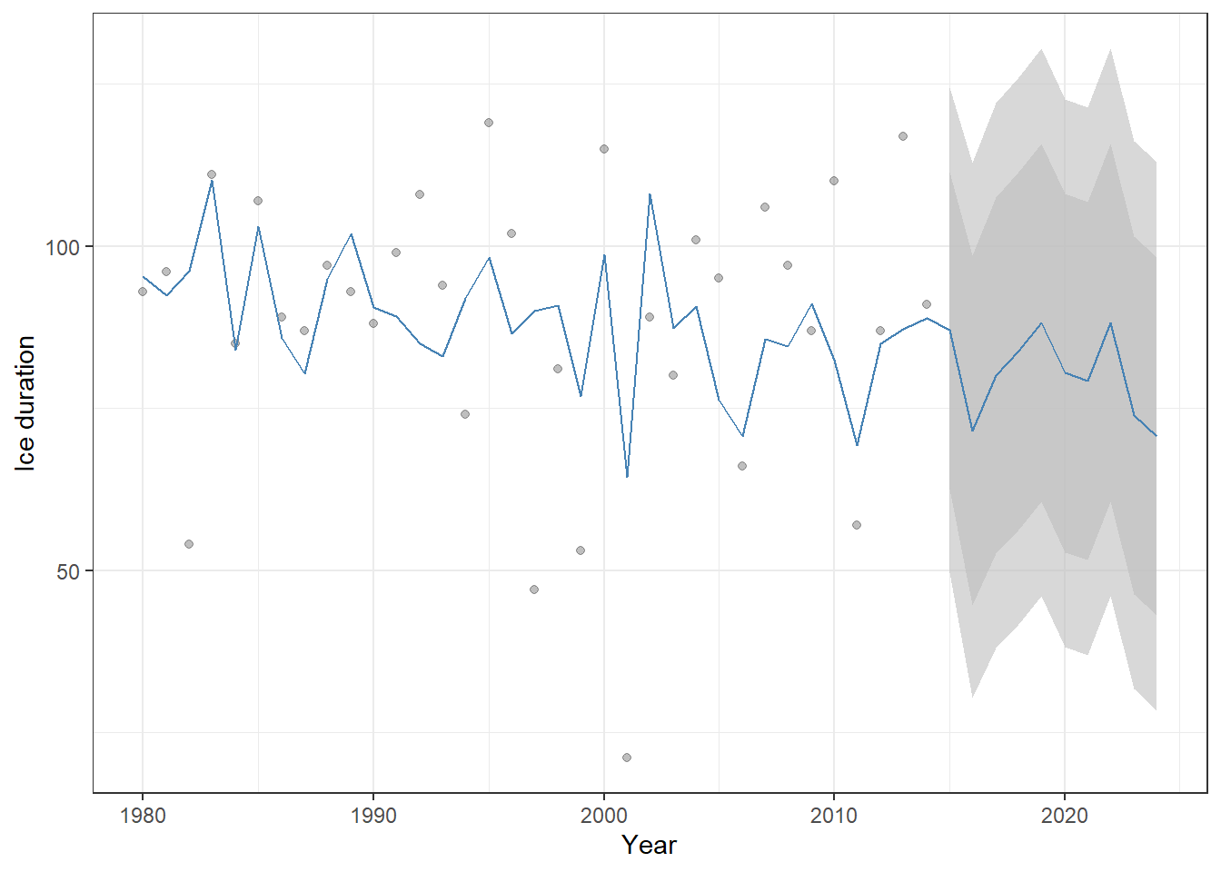
Figure 23.11: Historical ice-cover duration (points) and ARIMAX model predictions (blue line) for Lake Mendota, including forecasts for 2015–2024. Shaded ribbons show the 80% and 95% confidence intervals for the forecasts. Because temperature is included as a predictor, the forecast varies with future temperature values rather than remaining constant.
23.3.2 GLARMA
One major limitation of ARIMAX models is their assumption of normally distributed errors, which makes them unsuitable for non-normal data. To overcome this, the Generalized Linear ARMA (GLARMA) model was developed, analogous to the extension from linear models to generalized linear models.
In our next example, we analyze fish count data for Cutthroat Trout from Mack Creek, Oregon. Because these are count data, modeling the temporal process using a normal distribution would be inappropriate, making GLARMA a more suitable choice.
# Load HJ Andrews LTER vertebrate survey data
data("and_vertebrates")

df_ct <- and_vertebrates  %>%
  filter(species == "Cutthroat trout",
         length_1_mm > 160) %>%  # Keep only large cutthroat trout (hypothetical matured adults)
  group_by(year) %>% # Group records by year
  summarize(n = n(), # Count number of captures per year
            .groups = "drop") %>%
  arrange(year) # Arrange by year

df_ct %>%
  ggplot(aes(x = year,
             y = n)) +
  geom_line(linetype = "dotted") +
  geom_point() +
  labs(x = "Year",
       y = "Count") +
  theme_bw()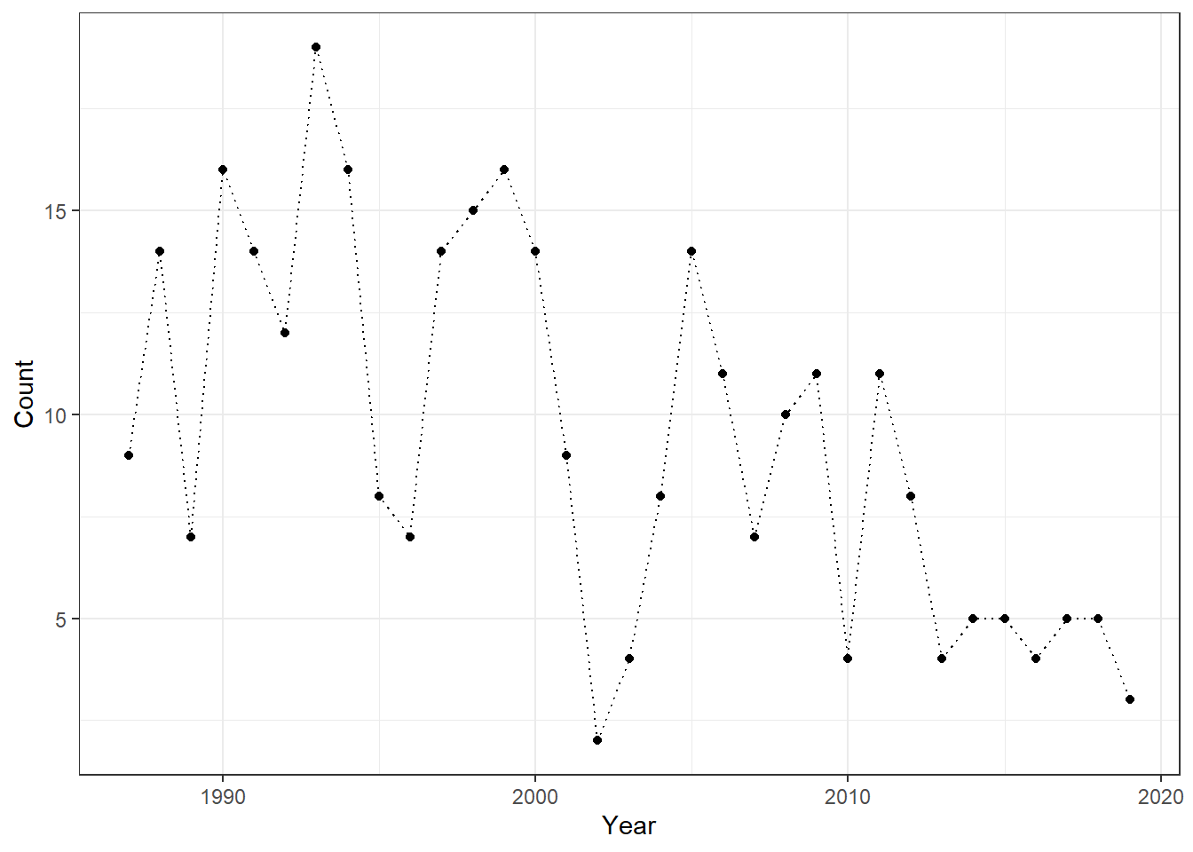
Cutthroat Trout is a cold-water species, so summer maximum temperature may be an important predictor of its abundance. To investigate this, we obtained climate data for Mack Creek from DAYMET.
# Download daily climate data from Daymet for Lake Mendota
list_mack <- download_daymet(
  site = "Mack_Creek",   # Arbitrary name you assign to this site
  lat = 44.2276,         # Latitude of the lake
  lon = -122.1673,       # Longitude of the lake
  start = 1987,          # Start year
  end = 2019,            # End year
  internal = TRUE        # Return the data as an R object rather than saving to disk
)
As in the ARIMAX example, we can summarize summer temperature data using date as the reference.
df_stemp <- list_mack$data %>%
  janitor::clean_names() %>%
    mutate(
    date = as.Date(paste(year, yday, sep = "-"), format = "%Y-%j"),
    month = month(date)
  ) %>%
  filter(month %in% c(6:8)) %>% # Select only summer months
  group_by(year) %>%
  summarize(temp_max = mean(tmax_deg_c)) # Averaging daily max temperature

# Add annual precipitation data by matching on year
df_ct <- df_ct %>%
  left_join(df_stemp,
            by = "year")
The data format for glarma() is somewhat unique. The response variable must be provided as a vector, while the predictors (summer temperature in this case) must be supplied as a matrix. It is also essential to include a column for the intercept (a column of ones); without it, interpretation of model coefficients can be difficult.
The type argument specifies the error distribution for the response variable. Since we are modeling count data, our first choice is the Poisson distribution. (type = "Poi").
The phiLags argument defines the order(s) of the AR process. Unlike the Arima() function, you can specify multiple AR orders separately—for example, 1 and 3, or 1 and 5. In this example, we will start with a first-order AR term as a baseline.
# Response variable: annual cutthroat trout counts
y <- df_ct$n

# Design matrix for mean structure
X <- model.matrix(~ temp_max, # Intercept + summer temperature predictor
                  data = df_ct)

obj_glarma <- glarma(
  y = y,                               # Count time series
  X = X,                               # GLM design matrix
  phiLags = 1,                         # AR structure in residuals (lag 1)
  type = "Poi"                         # Poisson to allow count data
)

summary(obj_glarma)                    # Model coefficients and diagnostics
##
## Call: glarma(y = y, X = X, type = "Poi", phiLags = 1)
##
## Pearson Residuals:
## Min 1Q Median 3Q Max
## -2.0852 -0.8918 -0.0879 1.0448 3.2881
##
## GLARMA Coefficients:
## Estimate Std.Error z-ratio Pr(>|z|)
## phi_1 0.1644 0.0415 3.962 7.42e-05 ***
##
## Linear Model Coefficients:
## Estimate Std.Error z-ratio Pr(>|z|)
## (Intercept) 3.50886 0.91518 3.834 0.000126 ***
## temp_max -0.05208 0.03614 -1.441 0.149537
##
## Null deviance: 76.138 on 32 degrees of freedom
## Residual deviance: 53.679 on 30 degrees of freedom
## AIC: 191.0176
##
## Number of Fisher Scoring iterations: 30
##
## LRT and Wald Test:
## Alternative hypothesis: model is a GLARMA process
## Null hypothesis: model is a GLM with the same regression structure
## Statistic p-value
## LR Test 10.45 0.00123 **
## Wald Test 15.70 7.42e-05 ***
## ---
## Signif. codes: 0 '***' 0.001 '**' 0.01 '*' 0.05 '.' 0.1 ' ' 1The Linear Model Coefficients section can be interpreted much like the output of a standard GLM. The temperature effect is estimated to be insignificant - compare this result with the glm() function with Poisson errors, which would produce a significant effect of summer temperature (i.e., likely Type I error due to temporal autocorrelation)!
In addition, GLARMA provides extra sections – most notably, GLARMA Coefficients – which summarize the estimated autoregressive (AR) parameters. In our example, the first-order AR parameter, phi_1, is estimated at approximately 0.16. This parameter is estimated on the link scale; for a Poisson distribution, that corresponds to the log scale.
Unfortunately, the glarma() function does not include automated model selection. Therefore, we must choose and compare model orders manually. Here, we will explore different AR orders, from 1 to 3. The following code fits these three models and reports their AIC values for comparison.
list_glarma <- lapply(1:3,
                      function(o) {
                        obj_glarma <- glarma(y = y,
                                             X = X,
                                             phiLags = c(1:o),
                                             type = "Poi")
                      })

lapply(list_glarma, function(x) x$aic)
## [[1]]
## [1] 191.0176
##
## [[2]]
## [1] 192.2589
##
## [[3]]
## [1] 192.8682The AR(1) model has the lowest AIC, suggesting that our initial choice of a first-order autoregressive term was reasonable. As with the Arima() function, the GLARMA model allows us to obtain fitted values using the fitted() function.
df_ct %>%
  mutate(fit = as.numeric(fitted(obj_glarma))) %>%  # Add GLARMA fitted values as a new column
  ggplot() +
  geom_point(aes(
    x = year,
    y = n,
    color = temp_max
  )) +
  geom_line(aes(
    x = year, # X-axis: year
    y = fit   # Y-axis: GLARMA fitted values
  )) +
  scale_color_viridis_c() + # Continuous color scale for temperature
  labs(
    y = "Population Count",
    x = "Year",
    color = "Temperature" # Legend title
  ) +
  theme_bw()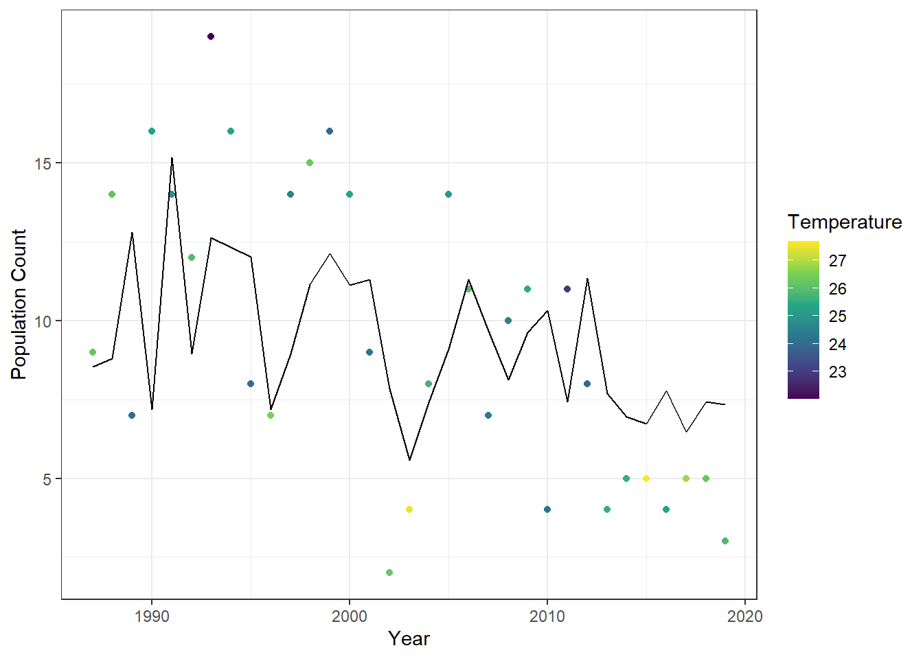
Figure 23.12: Observed annual cutthroat trout counts at Mack Creek, Oregon, colored by maximum summer temperature, with fitted values from the first-order GLARMA model overlaid as a line.