18 Generalized Additive Model
In generalized linear models (GLMs) and generalized linear mixed models (GLMMs), a key structural assumption is linearity on the scale of the linear predictor. That is, after applying the link function, the expected value of the response is assumed to be a linear combination of predictors and their associated parameters.
In biological and ecological data, however, relationships are often nonlinear but smooth, reflecting processes such as seasonality, thresholds, saturation, or diminishing returns. When these patterns are forced into a strictly linear framework, GLMs and GLMMs may yield biased parameter estimates, poor predictive performance, or misleading inference.
To address these limitations, this chapter introduces generalized additive models (GAMs), which extend GLMs by allowing predictors to enter the model as smooth functions rather than assuming linear effects.
Learning Objectives:
Understand the linearity assumptions underlying GLMs and GLMMs
Understand how smoothing functions relax these assumptions
Evaluate the advantages and limitations of additive models
pacman::p_load(tidyverse,
               ggeffects,
               mgcv)
18.1 Seasonal Data
18.1.1 Water temperature example
To illustrate the application of nonlinear models, we use water temperature data collected from artificial wetlands on the campus of the University of North Carolina, Greensboro. These data are publicly available and form part of Ibrahim et al. 2025.
link <- "https://raw.githubusercontent.com/aterui/biostats/master/data_raw/data_water_temp.csv"

(df_wt_raw <- read_csv(link))
## # A tibble: 77,596 × 4
## id date_time temp site
## <dbl> <chr> <dbl> <chr>
## 1 1 8/6/2021 18:00 23.1 woody
## 2 2 8/6/2021 18:15 23.1 woody
## 3 3 8/6/2021 18:30 23.1 woody
## 4 4 8/6/2021 18:45 23.2 woody
## 5 5 8/6/2021 19:00 23.2 woody
## 6 6 8/6/2021 19:15 23.2 woody
## 7 7 8/6/2021 19:30 23.2 woody
## 8 8 8/6/2021 19:45 23.2 woody
## 9 9 8/6/2021 20:00 23.2 woody
## 10 10 8/6/2021 20:15 23.3 woody
## # ℹ 77,586 more rowsThe dataset loaded from the provided link contains water temperature observations from wetlands and includes three main columns. The date_time column records the timestamp of each measurement, typically in month/day/year format. The site column indicates the wetland type or location (e.g., “woody” vs. “open”), serving as a factor to distinguish between different wetland types. Finally, the temp column provides the numeric water temperature in degrees Celsius, which can be used as the response variable in statistical models.
It is always a good practice to begin by checking the class of each column, as misunderstanding data types can lead to unnecessary confusion during data analysis.
sapply(df_wt_raw, class)## id date_time temp site
## "numeric" "character" "numeric" "character"A potential issue in this dataset is that the date_time column is stored as a “character.” Although data_time contains temporal information, the character data type does not allow R to interpret it as a date. In the following code, we will convert this column to a Date object, which explicitly encodes temporal information and enables time-based operations.
# Start from the raw water-temperature dataset
(df_wt <- df_wt_raw %>%
  mutate(
    # Convert the character datetime column into a Date object.
    # The format argument specifies month/day/year.
    date = as.Date(date_time,
                   format = "%m/%d/%Y"),
    # Extract the calendar year from the Date object
    year = year(date),
    # Extract the month (1–12) from the Date object
    month = month(date)
  ) %>%
  # Subset the data to observations from the year 2022 only
  # March through October
  filter(year == 2022,
         between(month, 3, 10)))
## # A tibble: 35,287 × 7
## id date_time temp site date year month
## <dbl> <chr> <dbl> <chr> <date> <dbl> <dbl>
## 1 19801 3/1/2022 0:00 7.67 woody 2022-03-01 2022 3
## 2 19802 3/1/2022 0:15 7.62 woody 2022-03-01 2022 3
## 3 19803 3/1/2022 0:30 7.57 woody 2022-03-01 2022 3
## 4 19804 3/1/2022 0:45 7.52 woody 2022-03-01 2022 3
## 5 19805 3/1/2022 1:00 7.44 woody 2022-03-01 2022 3
## 6 19806 3/1/2022 1:15 7.39 woody 2022-03-01 2022 3
## 7 19807 3/1/2022 1:30 7.34 woody 2022-03-01 2022 3
## 8 19808 3/1/2022 1:45 7.29 woody 2022-03-01 2022 3
## 9 19809 3/1/2022 2:00 7.27 woody 2022-03-01 2022 3
## 10 19810 3/1/2022 2:15 7.22 woody 2022-03-01 2022 3
## # ℹ 35,277 more rowsIn the example above, we restricted the dataset to the period from 2022-03-01 to 2022-10-31 because the woody site contains missing data outside this range. Next, we aggregate the data to daily means because the original measurements were recorded at 15-minute intervals, which is too fine-grained for our analysis.
# Aggregate raw water temperature data to daily averages
df_wt_daily <- df_wt %>%
  # Group the data by date and site
  # This ensures that averaging is done separately for each site on each day
  group_by(date, site) %>%
  # Compute summary statistics for each group
  summarize(
    # Take the mean of the 'temp' column within each group
    # na.rm = TRUE ignores missing values (NA) in the calculation
    # round(..., 3) rounds the resulting mean to 3 decimal places
    temp = mean(temp, na.rm = TRUE) %>% round(3)
  )
Since water temperature is seasonal, it rises from spring to summer and falls from summer to fall. These data are collected from two wetlands, and colors distinguish different types of wetlands.
# Visualize daily water temperature for each wetland site
df_wt_daily %>%
  ggplot(aes(
    x = date,      # Date on the x-axis
    y = temp,      # Daily averaged temperature on the y-axis
    color = site   # Color points by wetland type (woody vs open)
  )) +
  # Add points for each observation
  # alpha = 0.25 makes points semi-transparent to reduce overplotting
  geom_point(alpha = 0.25) +
  # Apply a clean black-and-white theme for readability
  theme_bw() +
  # Customize axis labels and legend title
  labs(
    x = "Date",                # x-axis label
    y = "Water Temperature",   # y-axis label
    color = "Wetland Type"     # legend title for the color mapping
  )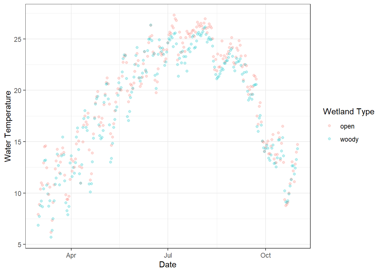
Figure 18.1: Daily water temperature measured in two types of artificial wetlands (“woody” and “open”) on the UNCG campus. Each point represents the daily average temperature, with semi-transparent points to reduce overplotting. Colors indicate wetland type, and the x-axis shows the date over the monitoring period.
What happens if we model this seasonal dataset using a linear model? We can explore this using the glm() (or lm()) function, and visualizing the predicted values will highlight the limitations of treating inherently seasonal data as linear.
# Add new variables and ensure proper data types
df_wt_daily <- df_wt_daily %>%
  mutate(
    # Convert the date column to Julian day (day of year)
    # Useful for modeling seasonal trends
    j_date = yday(date),
    # Ensure 'site' is treated as a factor (categorical variable)
    site = factor(site)
  )

# Fit a Generalized Linear Model (GLM) with Gaussian family
m_glm <- glm(
  temp ~ j_date + site,  # Model daily temperature as a function of Julian day and wetland site
  data = df_wt_daily,    # Dataset to use
  family = "gaussian"    # Specify Gaussian distribution (standard linear regression)
)

summary(m_glm)
##
## Call:
## glm(formula = temp ~ j_date + site, family = "gaussian", data = df_wt_daily)
##
## Coefficients:
## Estimate Std. Error t value Pr(>|t|)
## (Intercept) 15.165281 0.688730 22.019 < 2e-16 ***
## j_date 0.021495 0.003316 6.481 2.23e-10 ***
## sitewoody -0.640290 0.469106 -1.365 0.173
## ---
## Signif. codes: 0 '***' 0.001 '**' 0.01 '*' 0.05 '.' 0.1 ' ' 1
##
## (Dispersion parameter for gaussian family taken to be 26.95744)
##
## Null deviance: 14311 on 489 degrees of freedom
## Residual deviance: 13128 on 487 degrees of freedom
## AIC: 3009.7
##
## Number of Fisher Scoring iterations: 2The model suggests that water temperature increases with Julian date and that there is no significant difference between wetland types. However, this conclusion may be misleading because of the strong seasonal (nonlinear) pattern in the data. Visualizing the model-predicted values can help assess this result.
The ggpredict() function from the ggeffects package provides a convenient way to generate predicted values from a model, internally using the base predict() function. Factor variables (e.g., site) are returned as group, while continuous variables are returned as x; these can then be renamed to match the original column names for clarity.
# Generate model predictions across all Julian days and wetland sites
df_pred <- ggpredict(m_glm,
                     terms = c(
                       "j_date [all]",  # Use all observed values of Julian day
                       "site [all]"     # Generate predictions for all levels of the factor 'site'
                     )) %>%
  as_tibble() %>%
  # Rename the default columns to match the original dataset
  rename(site = group,  # 'group' from ggpredict() corresponds to the factor variable 'site'
         j_date = x     # 'x' from ggpredict() corresponds to the predictor 'j_date'
  )

# Plot daily water temperature and overlay model predictions
df_wt_daily %>%
  ggplot(aes(
    x = j_date,   # Julian day on x-axis
    y = temp,     # Observed daily temperature on y-axis
    color = site  # Color points by wetland type (factor)
  )) +
  geom_point(alpha = 0.25) +
  # Overlay predicted values from the model
  # df_pred contains predictions from ggpredict()
  # aes(y = predicted) maps the model's predicted temperature to y
  geom_line(data = df_pred,
            aes(y = predicted)) +
  theme_bw() +
  labs(x = "Julian Date",         # x-axis label
       y = "Water Temperature",   # y-axis label
       color = "Wetland Type"     # Legend title for site color
       )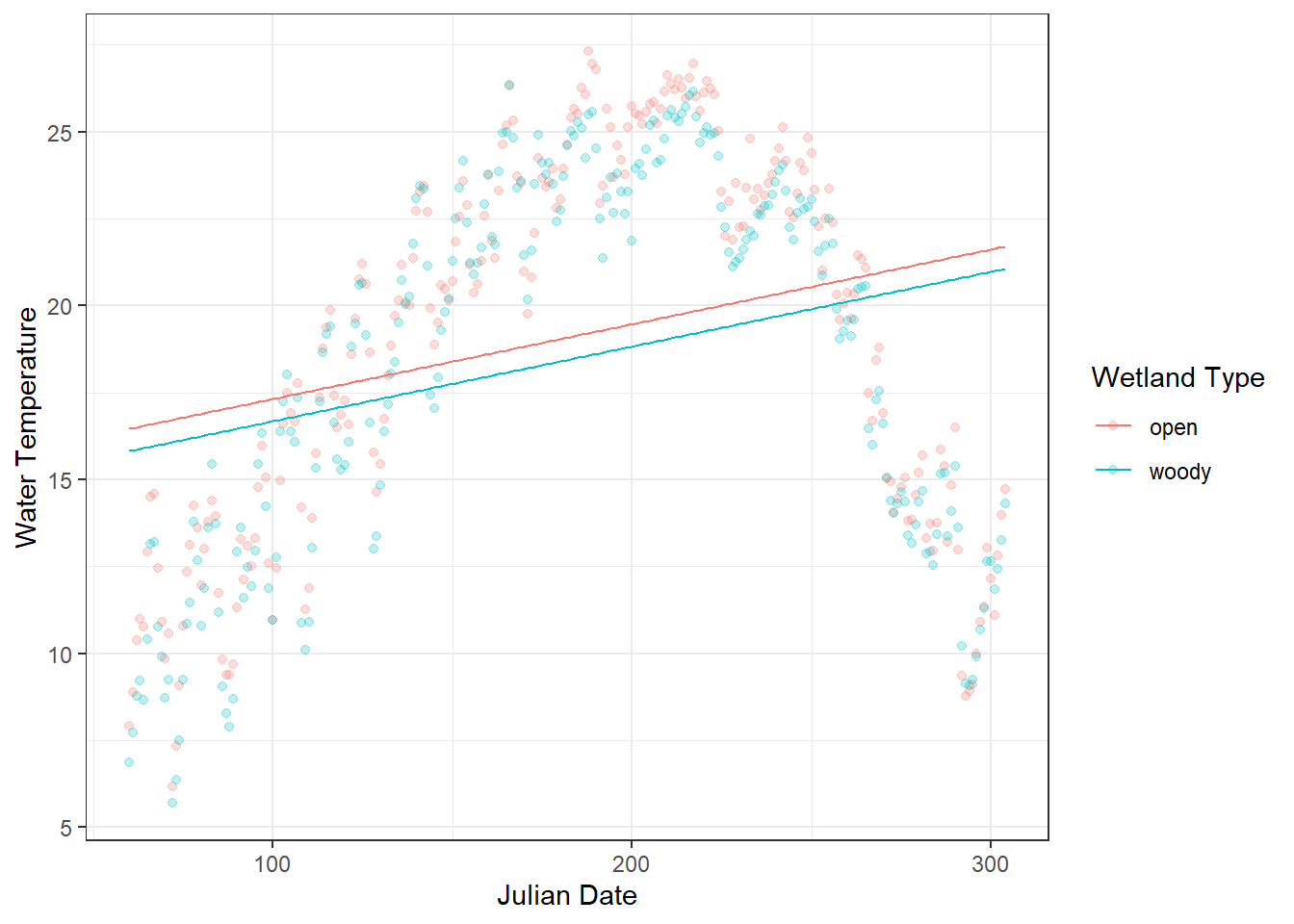
Figure 18.2: Daily water temperature in two types of artificial wetlands (“woody” and “open”) is shown as points, with semi-transparent markers to reduce overplotting. The overlaid lines represent predicted values from a linear model (glm) using Julian day and site as predictors. The plot highlights a clear mismatch between the observed seasonal fluctuations and the linear predictions, illustrating the limitations of modeling inherently seasonal data with a linear approach.
18.1.2 Smooth function
Linear models assume a straight-line relationship between predictors and the response. For seasonal data, like water temperature over a year, this assumption is often violated: temperatures rise in spring, peak in summer, and fall in autumn—a nonlinear pattern that a simple linear term cannot capture.
A Generalized Additive Model (GAM) extends linear models by replacing (one or more of) linear terms with smooth functions, allowing the relationship to bend and flex according to the data:
\[ y_i = \alpha + f(x) + \varepsilon_i \]
Here, \(f(\cdot)\) is a smooth function estimated from the data, often using splines. In practice, this means GAMs can model seasonal or other nonlinear trends without needing to specify the exact form of the curve in advance.
In R, we can use the mgcv package to implement this approach. We apply a smooth function s() to j_date to capture the clear seasonal pattern, while keeping site (wetland type) as a linear term, since we do not expect the effect of wetland type to vary nonlinearly.
m_gam <- gam(temp ~ site + s(j_date),
             data = df_wt_daily,
             family = "gaussian")

summary(m_gam)
##
## Family: gaussian
## Link function: identity
##
## Formula:
## temp ~ site + s(j_date)
##
## Parametric coefficients:
## Estimate Std. Error t value Pr(>|t|)
## (Intercept) 19.0774 0.1157 164.878 < 2e-16 ***
## sitewoody -0.6403 0.1636 -3.913 0.000104 ***
## ---
## Signif. codes: 0 '***' 0.001 '**' 0.01 '*' 0.05 '.' 0.1 ' ' 1
##
## Approximate significance of smooth terms:
## edf Ref.df F p-value
## s(j_date) 8.617 8.958 431.1 <2e-16 ***
## ---
## Signif. codes: 0 '***' 0.001 '**' 0.01 '*' 0.05 '.' 0.1 ' ' 1
##
## R-sq.(adj) = 0.888 Deviance explained = 89%
## GCV = 3.3527 Scale est. = 3.28 n = 490The interpretation of the parametric coefficients is largely the same as in GLMs or GLMMs. In this case, the effect of site (wetland type) becomes statistically significant. This occurs because the nonlinear seasonal pattern is modeled first through the smooth term, allowing the site effect to be assessed without being confounded by seasonal structure in the data.
The smooth term s(j_date) in the GAM captures the nonlinear seasonal variation in water temperature across the year. Its effective degrees of freedom (edf =8.62) indicate that the relationship is flexible rather than a straight line, allowing the model to follow the rise of temperature in spring, the peak in summer, and the decline in fall. The edf becomes approximately 1 when the smooth term represents an essentially linear effect - if this occurs, adding a predictor as a smooth term is not meaningful.
The extremely low p-value (<2e-16) shows that this seasonal pattern is highly significant, meaning that the smooth term explains a large portion of the variation in temperature that a linear term alone could not capture.
The GCV (generalized cross-validation) score (3.35) is worth mentioning because it is used to determine how wiggly the curve should be. A lower GCV indicates a better balance between model fit and smoothness, penalizing excessive curvature to avoid overfitting.
The ggpredict() function allows us to generate and visualize predicted values from a GAM.
df_pred_gam <- ggpredict(m_gam,
                         terms = c(
                           "j_date [all]",
                           "site [all]")
                         ) %>%
  as_tibble() %>%
  rename(site = group,
         j_date = x)

df_wt_daily %>%
  ggplot(aes(
    x = j_date,
    y = temp,
    color = site
  )) +
  geom_point(alpha = 0.25) +
  # Overlay predicted values from the GAM
  geom_line(data = df_pred_gam,
            aes(y = predicted)) +
  theme_bw() +
  labs(x = "Julian Date",         # x-axis label
       y = "Water Temperature",   # y-axis label
       color = "Wetland Type"     # Legend title for site color
       )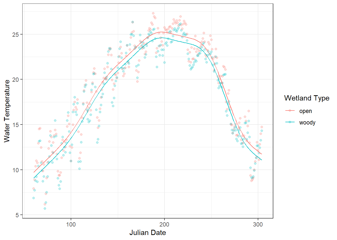
Figure 18.3: Daily water temperature in two types of artificial wetlands (“woody” and “open”) is shown as points, with semi-transparent markers to reduce overplotting. The overlaid lines represent predicted values from a linear model (glm) using Julian day and site as predictors. The plot highlights a clear mismatch between the observed seasonal fluctuations and the linear predictions, illustrating the limitations of modeling inherently seasonal data with a linear approach.
Key insights for practical use:
- Smooth terms (
s(x)) allow flexible, data-driven curves. - The model automatically balances fit vs. smoothness to avoid overfitting.
- Categorical or other continuous predictors can be included as linear predictors alongside smooth terms.
This GAM framework lets you move from linear approximations to flexible, realistic modeling of seasonal patterns, which can then be illustrated with a simple water temperature example before diving into mathematical details.
18.2 Estimating Smoothness
18.2.1 Choice of smooth function
By default, mgcv::s() employs thin plate regression splines as a smoothing function. While this is one of the most broadly applicable approaches, other options may be more appropriate depending on the structure of your data. The following table summarizes the possible alternatives offered in the mgcv package, along with their typical applications.
| Smoother / Option | How to Specify | Description | Typical Use Case / Notes |
|---|---|---|---|
| Thin plate regression spline (default) | s(x) |
Flexible, general-purpose spline that does not require knot placement. | Default in mgcv::s(); works well in most situations. |
| Cubic regression spline | s(x, bs = "cr") |
Standard cubic spline with specified knots. | Good when you want explicit control over knots or smoothness. |
| Cyclic spline | s(x, bs = "cc") |
Ensures smooth connection at boundaries for circular predictors. | Ideal for seasonal or periodic variables (e.g., day-of-year). |
| P-spline | s(x, bs = "ps") |
Penalized B-spline allowing control over wiggliness via penalties. | Useful for evenly spaced predictors; can handle large datasets efficiently. |
| Thin plate regression spline with shrinkage | s(x, bs = "ts") |
Adds extra penalization to allow smooth term to shrink to zero if not important. | Useful for model selection or when some smooth terms may be irrelevant. |
| Tensor product smooths | te(x1, x2) |
Combines multiple continuous predictors, allowing interactions on different scales. | Use for multidimensional ecological responses (e.g., temperature × flow). |
18.2.2 Penalty strength
In a GAM, smooth terms are flexible functions whose degree of curvature (wiggliness) must be estimated from the data. In the mgcv package, this is done automatically by selecting a smoothing parameter that balances goodness of fit against model complexity.
By default, mgcv uses generalized cross-validation (GCV) to determine this smoothing parameter. In other words, GCV decides the strength of the penalty applied to the smooth term: a stronger penalty produces a smoother, less wiggly curve, while a weaker penalty allows more flexibility to follow data fluctuations. Conceptually, GCV asks: How well would this model predict new data if we slightly penalize excessive curvature? A smoother that fits the data too closely (overfitting) is penalized, while a smoother that is too rigid (underfitting) fails to capture important structure. The chosen smoothness minimizes the GCV score, yielding a curve that is flexible enough to capture real patterns but smooth enough to generalize beyond the observed data.
However, there are other options for the penalty selection method, which can be specified via the method argument in mgcv::gam():
| Penalty Selection Method | How to Specify | Notes / Typical Use |
|---|---|---|
| GCV / GACV |
method = "GCV.Cp" (or default) |
Balances fit vs. wiggliness; default in many examples. |
| REML | method = "REML" |
Preferred for stable inference; treats smoothness as a variance component. |
| ML | method = "ML" |
Useful for comparing nested models using likelihood-based criteria. |
| UBRE / P-UBRE | method = "UBRE" |
Based on unbiased risk estimate; mainly for Gaussian models. |