19 Unconstrained Ordination
So far, our modeling exercises have focused on univariate analyses, where we model a single response variable using one or more predictors. In practice, biological data are often multivariate, with multiple variables describing the same system. It is useful to reduce many correlated variables into a smaller number of axes that capture the main patterns of variation. In this chapter, we will learn methods that allow us to summarize multivariate data into fewer dimensions.
Learning Objectives:
Understand and apply unconstrained ordination methods such as PCA and NMDS to summarize and visualize multivariate data.
Interpret ordination outputs, including principal component axes, NMDS coordinates, and stress values.
Compare and select appropriate ordination methods (PCA, NMDS, PCoA, CA, MCA) based on data type, distribution, and research questions.
pacman::p_load(tidyverse,
               GGally,
               vegan)
19.1 Methods for Unconstrained Ordination
We will explore unconstrained ordination methods for summarizing multivariate data. These methods differ in their assumptions, flexibility, and how interpretable the axes are, and the choice of method depends on the goals of your analysis. Here, we will focus on two extreme cases—PCA and NMDS—and demonstrate their application with examples. We will conclude by briefly introducing other ordination options, highlighting their potential uses for future analyses.
19.1.1 PCA
Flower “shape”
We will use the iris dataset for this exercise. This dataset contains multiple measurements of each flower from the same individual, and these measurements (length and width dimensions of sepal and petal) are highly correlated, collectively capturing the overall “shape” of the flower.
Before we begin, we will clean the data to simplify variable names and ensure consistency, since mixed cases and formatting can be cumbersome.
# Convert the built-in iris dataset into a tibble and clean column names
df_iris <- iris %>%
  as_tibble() %>%               # Convert from data.frame to tibble for tidyverse-friendly operations
  janitor::clean_names()        # Standardize column names: lowercase, replace spaces/special characters
Next, we explore the relationships among the numeric measurements in the iris dataset. Since the variables are likely correlated, we use a scatterplot matrix to visualize pairwise relationships and see how the three species differ. The ggpairs() function from the GGally package makes this easy.
df_iris %>%
  ggpairs(
    progress = FALSE, # Disable progress bar during plotting
    columns = c("sepal_length", # Select the four numeric columns to include
                "sepal_width",
                "petal_length",
                "petal_width"),
    aes(
      color = species, # Color points by species
      alpha = 0.5 # Make points semi-transparent for better visibility
    )
  ) +
  theme_bw() # Use a clean theme for better readability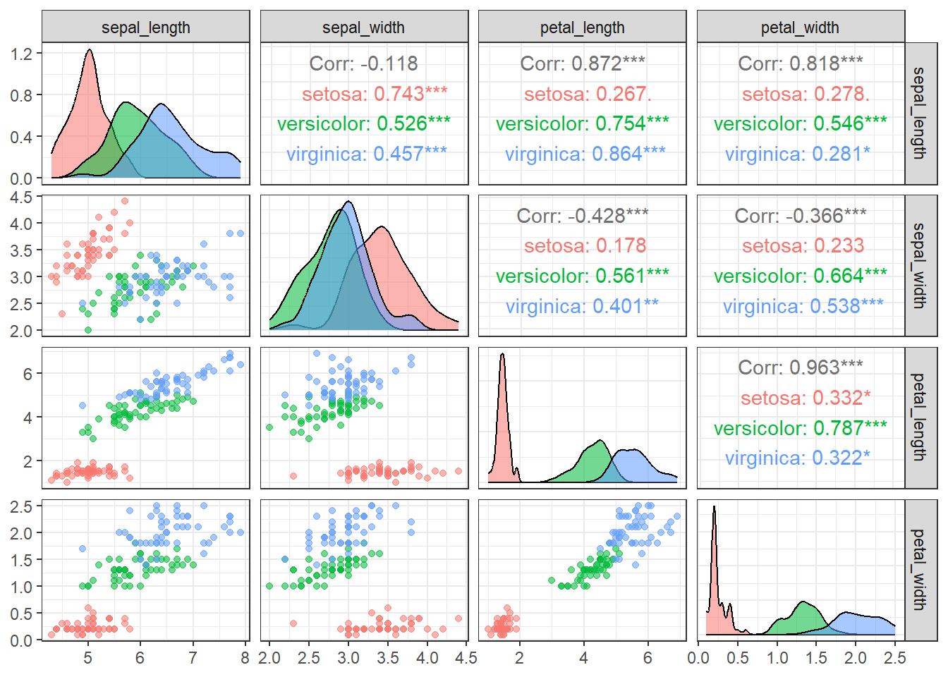
Figure 19.1: Pairwise scatterplots of the four iris traits (sepal length, sepal width, petal length, and petal width) colored by species. The plots show relationships among traits, highlight species-specific trait distributions, and reveal correlations or patterns in the data.
With few exceptions, most variable combinations are correlated with each other, suggesting that they may contain overlapping information that can be summarized along fewer axes.
When variables are approximately normally distributed and show substantial correlations, Principal Component Analysis (PCA) provides an effective way to summarize multiple variables into a smaller set of axes. PCA identifies orthogonal axes based on the variance–covariance structure of the variables, under the assumption of multivariate normality.
Without going into too much detail, PCA can be performed in R using the prcomp() function. For simplicity, the example below focuses on two variables (petal_length and petal_width). An important point when using prcomp() is to almost always set scale = TRUE explicitly, since PCA is not intended to summarize variables measured on different scales or with different variances.
# Extract only the petal measurements from the iris dataset
df_petal <- df_iris %>%
  # Select columns whose names start with "petal_" (petal length and petal width)
  select(starts_with("petal_"))

# Perform Principal Component Analysis (PCA) on the selected petal data
obj_pca <- prcomp(
  x = df_petal,    # Input data for PCA
  center = TRUE,   # Subtract the mean of each column so variables are centered at 0
  scale = TRUE     # Divide by the standard deviation of each column so variables have unit variance
)

# obj_pca now contains:
# - obj_pca$x        : PCA scores (coordinates of each sample in PC space)
# - obj_pca$rotation : Eigenvectors (directions of principal components)
# - obj_pca$sdev     : Standard deviations of the principal components (square = variance explained)

print(obj_pca)
## Standard deviations (1, .., p=2):
## [1] 1.4010230 0.1927033
##
## Rotation (n x k) = (2 x 2):
## PC1 PC2
## petal_length 0.7071068 -0.7071068
## petal_width 0.7071068 0.7071068The standard deviations of the principal components (PCs) indicate how much the data varies along each axis. In this case, PC1 has a standard deviation of 1.401, much higher than PC2’s 0.193, meaning that most of the variation in petal length and width occurs along PC1. Squaring these values gives the eigenvalues, which quantify the variance captured by each component.
Proportional contributions of PC axes can be displayed with summary() function:
summary(obj_pca)## Importance of components:
## PC1 PC2
## Standard deviation 1.4010 0.19270
## Proportion of Variance 0.9814 0.01857
## Cumulative Proportion 0.9814 1.00000The proportion of variance shows that PC1 explains approximately 98% of the total variance, while PC2 accounts for only about 2%. The cumulative proportion confirms that together they capture 100% of the variation. This means PC1 effectively summarizes almost all the information in the dataset, and PC2 adds very little new insight.
Visualization helps illustrate how PCA summarizes the variables. As shown in this figure, the principal component axes identified by prcomp() represent orthogonal dimensions of the relationships, with the first axis capturing the largest variance (eigenvalue) and therefore most of the information from the original variables.

Figure 19.2: Scatter plot of scaled petal length and width for three Iris species (subtract the means, then divide by SDs). Points represent individual flowers and are colored by species. Red lines represent the contribution of each principal component to the variation in petal length and width. Black arrows indicate the directions of the principal components for visual reference. Text labels at the arrow tips denote the corresponding principal component.
Extracting PC values
Once PCA is performed, you may wonder how the original data points are positioned in the PCA space. The prcomp() function returns the principal component (PC) scores for each data point, allowing you to relate these values back to the original data. These coordinates are stored in the $x element of the prcomp object, where the first and second columns correspond to PC1 and PC2 (and additional columns correspond to as many axes as the number of variables included in the PCA).
Since prcomp() preserves the order of the original data, you can safely combine the $x scores with the original dataset using bind_cols(). Just be careful not to alter the row order, as this would misalign the PC scores with the corresponding original observations.
# Combine the original iris dataset with PCA scores
df_pca <- bind_cols(
  df_iris,              # Original dataset (all columns: species, sepal, and petal measurements)
  as_tibble(obj_pca$x)  # PCA scores for each observation (PC1, PC2, ...)
)
In this example, we will focus on PC1, since PC2 contributes very little information about petal shape. Converting PC1 into an ordinal code allows us to compare how its values differ among species.
df_pca %>%
  ggplot(aes(
    x = species,   # x-axis: categorical variable (species)
    y = PC1,       # y-axis: PCA scores for the first principal component
    color = species # Color the boxplots by species
  )) +
  geom_boxplot() +
  labs(x = "Species",
       y = "Petal shape (PC1)")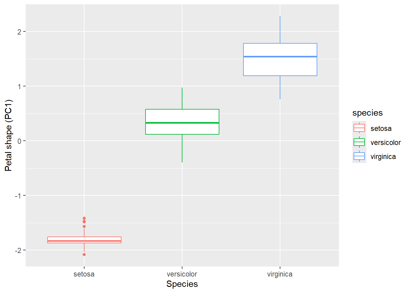
19.1.2 NMDS
Dune community data
Having explored PCA using the iris dataset, we saw how linear ordination can summarize variation in continuous, roughly normally distributed traits. However, many biological datasets do not meet these assumptions. For example, species abundances are often zero-inflated, skewed, or otherwise non-normal.
Non-metric ordination methods, such as Non-metric Multidimensional Scaling (NMDS), overcome the limitations of linear ordination by operating directly on a matrix of pairwise dissimilarities between sites (or other observational units). In this example, we will use the dune dataset, Vegetation and Environment in Dutch Dune Meadows, to illustrate the strengths and applications of NMDS.
## call sample data from vegan package
data(dune)
The dune dataset contains a species abundance matrix with 20 rows and 30 columns. Each row represents a unique sampling site in the dune meadows, and each column corresponds to a plant species. The values indicate the abundance of each species at each site, typically measured as counts of individuals or percent cover. This multivariate structure makes the dataset well suited for ordination methods, as each site can be characterized by its overall species composition.
## the first 3 species
head(dune[, 1:3])
## Achimill Agrostol Airaprae
## 1 1 0 0
## 2 3 0 0
## 3 0 4 0
## 4 0 8 0
## 5 2 0 0
## 6 2 0 0Visualization reveals pronounced non-normality and non-linearity in the data. As an example, we plot the first three species. The distributions are strongly right-skewed, clearly deviating from a normal distribution.
# Take the 'dune' dataset from vegan
dune %>%
  as_tibble() %>%         # Convert 'dune' from matrix/data frame to tibble for tidyverse compatibility
  select(1:3) %>%         # Select the first three species (columns) for visualization
  ggpairs() +             # Create a pairwise scatterplot matrix (plots all pairwise relationships)
  theme_bw()              # Apply a clean, minimal theme with a white background
Figure 19.3: Pairwise scatterplots of the first three plant species in the Dutch dune meadows dataset (dune). The plots visualize relationships among species abundances across sites, highlighting correlations, patterns, and potential non-normality in the data.
In PCA, when representing the data using a reduced number of axes, the method identifies orthogonal dimensions that capture the main “cloud” of variation in the data. However, if the underlying relationships are non-linear, this linear approach may fail to capture important patterns.
In contrast, NMDS aims to find a set of axes that best preserve the ranked dissimilarities between sites. The first step in NMDS is to convert the community matrix into a distance matrix. This produces an N × N matrix (where N is the number of sites), with each cell representing the dissimilarity in species composition between a pair of sites. The vegdist() function from the vegan package provides a straightforward way to compute a distance (or dissimilarity) matrix from a community or multivariate dataset.
# Compute pairwise dissimilarities between sites using Bray-Curtis distance
m_bray <- vegdist(dune,       # Input community matrix (sites × species)
                  method = "bray")  # Use Bray-Curtis dissimilarity, commonly used in ecology

# Inspect the first 3 rows and columns of the distance matrix
# Convert 'm_bray' (a dist object) to a standard matrix for easy subsetting
data.matrix(m_bray)[1:3, 1:3]  # Show pairwise dissimilarities among the first 3 sites
## 1 2 3
## 1 0.0000000 0.4666667 0.4482759
## 2 0.4666667 0.0000000 0.3414634
## 3 0.4482759 0.3414634 0.0000000Here, we used the “Bray-Curtis” distance (method = "bray), which is a widely used measure of dissimilarity in ecology that quantifies differences in species composition between two sites based on abundances. It ranges from 0 (identical composition) to 1 (completely different composition). Importantly, Bray-Curtis ignores joint absences—species absent from both sites do not contribute to dissimilarity—making it well-suited for ecological community data.
Other distance or dissimilarity measures are also available, depending on the type of data and the ecological question. Examples include Jaccard, Euclidean, Manhattan, and many others. A full list of metrics supported by vegdist() in the vegan package can be found here.
Next, we will use the metaMDS() function from the vegan package to perform NMDS on this distance matrix.
# Perform Non-metric Multidimensional Scaling (NMDS)
obj_nmds <- metaMDS(
  m_bray,   # Input distance matrix (e.g., Bray-Curtis dissimilarities between sites)
  k = 2     # Number of dimensions (axes) to represent in the NMDS solution
)
## Run 0 stress 0.1192678
## Run 1 stress 0.1183186
## ... New best solution
## ... Procrustes: rmse 0.02027061 max resid 0.06496334
## Run 2 stress 0.1886532
## Run 3 stress 0.1886532
## Run 4 stress 0.1192678
## Run 5 stress 0.1183186
## ... Procrustes: rmse 4.650431e-06 max resid 1.53307e-05
## ... Similar to previous best
## Run 6 stress 0.1192678
## Run 7 stress 0.1812933
## Run 8 stress 0.1183186
## ... Procrustes: rmse 1.144619e-06 max resid 3.080589e-06
## ... Similar to previous best
## Run 9 stress 0.1192679
## Run 10 stress 0.1192679
## Run 11 stress 0.2035424
## Run 12 stress 0.1192678
## Run 13 stress 0.2075713
## Run 14 stress 0.1192678
## Run 15 stress 0.1900906
## Run 16 stress 0.1183186
## ... Procrustes: rmse 1.098301e-05 max resid 3.764092e-05
## ... Similar to previous best
## Run 17 stress 0.1192678
## Run 18 stress 0.1192678
## Run 19 stress 0.1192678
## Run 20 stress 0.1183186
## ... Procrustes: rmse 1.983547e-05 max resid 6.214347e-05
## ... Similar to previous best
## *** Best solution repeated 4 timesThe metaMDS() function positions sites in a user-specified k-dimensional space (k = 2) so that the ranked distances (not observed distances!) in this reduced space closely match the original dissimilarities. It achieves this through an iterative optimization algorithm.
The resulting NMDS object contains several important pieces of information. It includes the coordinates of sites in NMDS space, which can be used for visualization or further analysis. It also reports a stress value, which quantifies how well the low-dimensional configuration represents the original distance relationships, with lower stress indicating a better fit. The above analysis resulted in the stress value of 0.12.
| Stress Value | Interpretation |
|---|---|
| 0.00 - 0.05 | Excellent representation; distances in NMDS closely match original dissimilarities |
| 0.05 - 0.10 | Good representation; minor distortions in distances |
| 0.10 - 0.20 | Fair representation; some distortions present but overall structure interpretable |
| 0.20 - 0.30 | Poor representation; results should be interpreted with caution |
| > 0.30 | Very poor representation; ordination is likely unreliable |
Additionally, the object stores information about the optimization process, including the number of iterations and whether the algorithm successfully converged.
Visualize NMDS
Often, we are interested in how external factors shape community structure. To explore these relationships, it is helpful to relate the positions of communities in NMDS space to relevant grouping or environmental variables, allowing us to visualize and interpret patterns in community composition.
The dune dataset comes along with environmental data dune.env so we can associate ordination output (whether NMDS, PCoA, or other methods) with site attributes.
##    A1 Moisture Management      Use Manure
## 1 2.8        1         SF Haypastu      4
## 2 3.5        1         BF Haypastu      2
## 3 4.3        2         SF Haypastu      4
## 4 4.2        2         SF Haypastu      4
## 5 6.3        1         HF Hayfield      2
## 6 4.3        1         HF Haypastu      2
The dune.env dataset contains 5 environmental variables for the 20 dune meadow sites.
A1 measures the thickness of the topsoil horizon (top mineral layer).
Moisture is an ordered factor indicating soil moisture levels from dry to wet (levels 1, 2, 4, 5).
Management is a categorical variable describing the management type: Biological farming (
BF), Hobby farming (HF), Nature Conservation Management (NCM), or Standard Farming (SF).Use indicates land-use intensity as an ordered factor from Hayfield to Haypastu to Pasture.
Manure is an ordered factor showing manure application levels from 0 to 4.
In this exercise, we will use the “Use” column to investigate whether variations in land-use intensity correspond to differences in plant community composition. The NMDS output stores the coordinates of each site in NMDS space in the $points element, with rows ordered according to the original distance matrix. While you can directly associate site attributes with these coordinates, it is important to ensure that the row order remains consistent to avoid mismatches.
# Combine environmental data with NMDS coordinates
df_nmds <- dune.env %>%           # Start with the environmental data for each site
  as_tibble() %>%                  # Convert to tibble for tidyverse-friendly operations
  bind_cols(obj_nmds$points) %>%   # Add NMDS coordinates (site scores) as new columns
  janitor::clean_names()           # Clean column names (lowercase, replace spaces/special characters)

# Visualize NMDS site scores with points and 95% confidence ellipses by land-use intensity
df_nmds %>%
  ggplot(aes(
    x = mds1,           # NMDS axis 1 (first dimension from metaMDS)
    y = mds2,           # NMDS axis 2 (second dimension from metaMDS)
    color = use         # Color points by land-use intensity (or other grouping variable)
  )) +
  geom_point(size = 3) +               # Plot each site as a point, slightly larger for visibility
  stat_ellipse(level = 0.95,           # Draw 95% confidence ellipses around each group
               linetype = 2) +        # Dashed line for ellipse
  theme_bw() +                         # Apply a clean black-and-white theme
  labs(color = "Land-use intensity",   # Add a legend title
       x = "NMDS1",                    # Label x-axis
       y = "NMDS2")                    # Label y-axis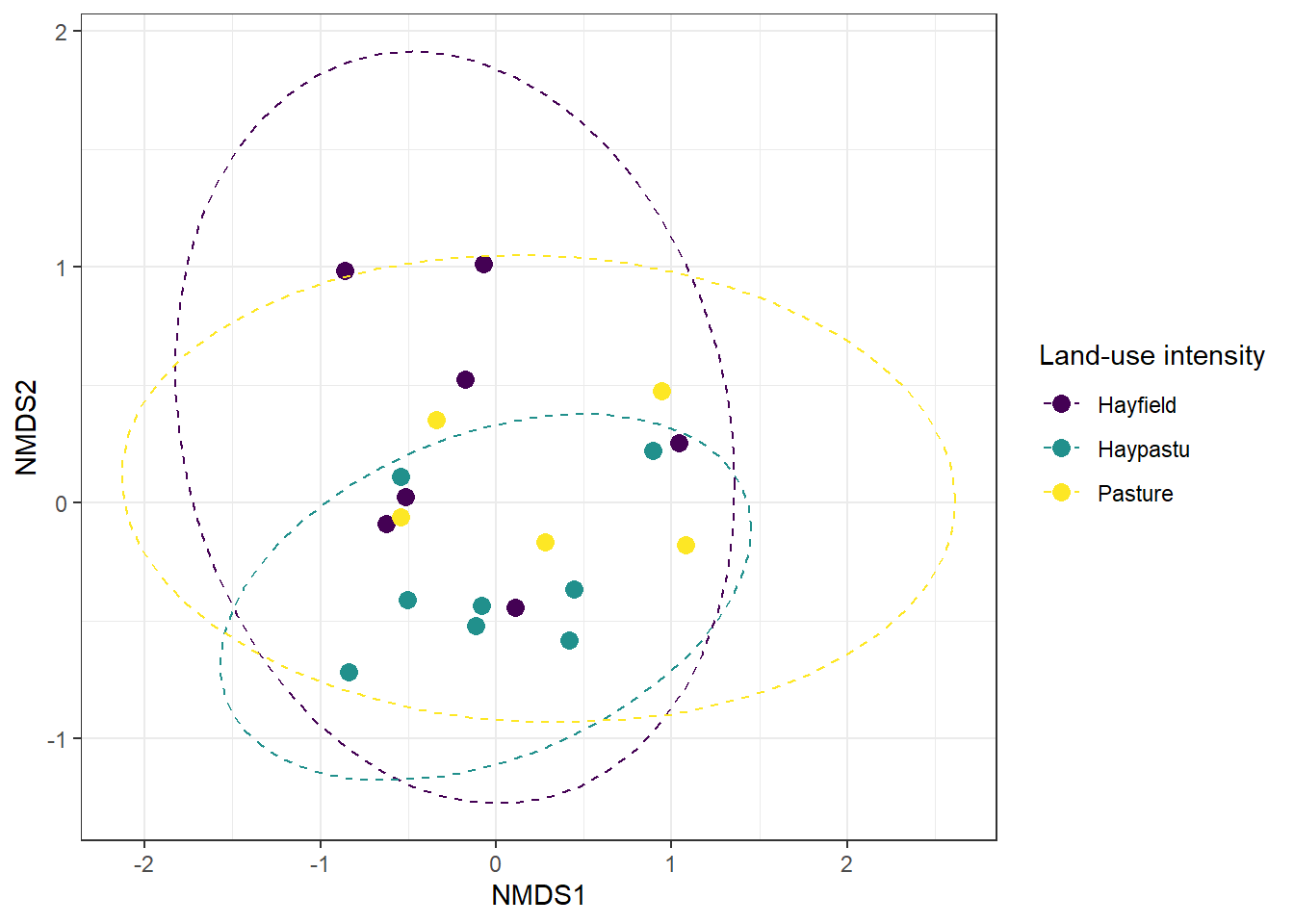
Figure 19.4: NMDS ordination of plant communities in the Dutch dune meadows dataset (dune), with sites colored by land-use intensity (Use). The plot visualizes differences in community composition among sites along the first two NMDS axes.
From the NMDS plot, it appears that sites with different land-use intensities might occupy slightly different regions in ordination space, suggesting potential differences in plant community composition. While visual inspection provides a useful first impression, we need a formal statistical test to determine whether these apparent group differences are significant.
Test with PERMANOVA
To formally test whether plant community composition differs among levels of land-use intensity, we can use PERMANOVA (Permutational Multivariate Analysis of Variance).
Unlike traditional MANOVA, PERMANOVA does not assume multivariate normality and can be applied directly to a distance or dissimilarity matrix, such as the Bray-Curtis distances used in the NMDS analysis.
This approach assesses whether the centroids of groups—here, the categories of the “Use” variable—differ significantly in multivariate space. The adonis2() function from the vegan package can be used to perform this analysis, testing whether plant community composition differs among groups based on a chosen environmental factor.
# Perform PERMANOVA to test whether plant community composition differs by land-use intensity
adonis2(
  m_bray ~ use,   # Model formula: Bray-Curtis dissimilarities (m_bray) explained by 'use' factor
  data = df_nmds  # Data frame containing the grouping variable 'use' aligned with the distance matrix
)
## Permutation test for adonis under reduced model
## Terms added sequentially (first to last)
## Permutation: free
## Number of permutations: 999
##
## adonis2(formula = m_bray ~ use, data = df_nmds)
## Df SumOfSqs R2 F Pr(>F)
## use 2 0.5532 0.12867 1.2552 0.252
## Residual 17 3.7459 0.87133
## Total 19 4.2990 1.00000We used PERMANOVA to test whether plant communities differ among the three land-use intensity categories (use). This method looks at the overall differences in species composition between groups and compares them to differences within groups. In our analysis, land-use intensity explains about 13% of the variation in plant communities, while the remaining 87% comes from other factors or natural variation (column R2).
The test gave a p-value of 0.258, which means the differences we see are not statistically significant. In simple terms, even though the NMDS plot shows some separation between sites with different land-use intensity, the test suggests that these differences could easily have happened by chance. So, we do not have strong evidence that land-use intensity alone drives changes in plant community composition in this dataset.
19.1.3 Other Options
There are many options for unconstrained ordination, and we have explored two extremes. PCA preserves the most quantitative information from the original variables, but it comes with strict assumptions, including linearity and normality. In contrast, NMDS is highly flexible and applicable to a wide range of multivariate data, but it only preserves qualitative, ranked information in the reduced dimensions.
Other ordination methods fall somewhere between these two approaches. For example, Principal Coordinates Analysis (PCoA) can accommodate a variety of distance metrics; Correspondence Analysis (CA) is designed for categorical or count data, rather than continuous variables. Selecting the appropriate method depends on the type and distribution of the data as well as the specific ecological questions being addressed.
| Method | Advantage | Limitation | Example Applications |
|---|---|---|---|
| PCA (Principal Component Analysis) | Preserves maximum quantitative variation; easy to interpret; widely used | Assumes linear relationships and roughly normal distribution; sensitive to outliers | Continuous trait data, environmental gradients, physiological measurements |
| PCoA (Principal Coordinates Analysis) | Can use any distance or dissimilarity metric; preserves distances as well as possible | May produce negative eigenvalues if data not Euclidean; interpretation depends on metric chosen | Community ecology, phylogenetic distances, functional trait distances |
| CA (Correspondence Analysis) | Works directly on count data; simultaneously ordinates sites and species; produces interpretable eigenvalues | Designed for count/abundance data rather than continuous variables; can produce “arch effect” with long gradients | Species-by-site abundance matrices, ecological community composition |
| MCA (Multiple Correspondence Analysis) | Reduces dimensionality of multiple categorical variables; reveals patterns and associations among categories | Requires categorical variables; can be computationally intensive with many categories; interpretation requires understanding of dummy coding | Survey data with multiple choice questions, demographic patterns, clinical categorical variables, questionnaire analysis |
| NMDS (Non-metric Multidimensional Scaling) | Very flexible; works with many data types and dissimilarity metrics; handles non-linear patterns and long gradients well | Only preserves rank-order information; axes not directly interpretable in units of original variables; requires multiple runs | Ecological community data with skewed or zero-inflated abundances; species composition comparisons |
19.1.4 Axis Interpretability
One key difference among ordination methods lies in the interpretability of the axes themselves. Methods can be broadly categorized into those with directly interpretable axes and those with abstract distance-based axes.
PCA, CA, and MCA produce axes that are meaningful transformations of the original data:
PCA: The axes (principal components) are linear combinations of the original variables, so the coordinates along each axis are meaningful and can be interpreted in terms of the original measurements. For example, higher values on PC1 may reflect larger trait values or abundances across species. Each axis explains a specific percentage of the total variance, and loadings show how original variables contribute to each component.
CA: The axes are weighted averages of species scores (for sites) and site scores (for species), with units in standard deviations of species turnover. Sites with similar species composition cluster together, and the position along each axis reflects species compositional change. Eigenvalues indicate the strength of each axis in capturing species turnover.
MCA: Similar to PCA but for categorical data, the axes represent dimensions of variation among categorical variables. Coordinates reflect the association strength with particular categories, and contributions of each category to each dimension can be quantified.
PCoA and NMDS create axes in arbitrary units where only relative positions matter:
PCoA: Axes preserve the distances between samples as faithfully as possible based on the chosen distance metric. The axes themselves are in arbitrary units, but eigenvalues show how much of the total distance variation each axis captures. The interpretation depends entirely on which distance metric was used (e.g., Bray-Curtis, UniFrac).
NMDS: Axes are purely abstract dimensions constructed to best preserve the rank order of dissimilarities between sites. The numeric values along NMDS axes do not have inherent meaning; only the relative distances between points matter. Unlike PCoA, NMDS doesn’t even preserve exact distances—only their rank order. As a result, NMDS plots are interpreted in terms of patterns of similarity or separation among sites, not in terms of the absolute values on each axis. The quality of fit is measured by stress values rather than variance explained.
Practical implication: For methods with interpretable axes (PCA, CA, MCA), you can meaningfully describe what high or low values on an axis represent. For distance-based methods (PCoA, NMDS), you can only describe which samples are similar or dissimilar to each other.